

Lunge Fitness & Wellness
Lunge Fitness & Wellness
Lunge Fitness & Wellness
IOS App
IOS App
IOS App


Overview
Overview
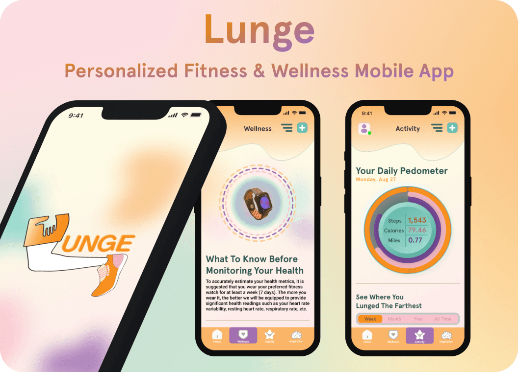
There has been an increasing awareness of how essential physical activity is for increasing one’s natural lifespan and maintaining quality standards of functional and mental health. This app seeks to ensure support and accountability regarding the many facets that are typical in an active lifestyle, such as calorie monitoring, nutritious dieting, and professional guidance on various workouts to contribute towards optimal health outcomes.
There has been an increasing awareness of how essential physical activity is for increasing one’s natural lifespan and maintaining quality standards of functional and mental health. This app seeks to ensure support and accountability regarding the many facets that are typical in an active lifestyle, such as calorie monitoring, nutritious dieting, and professional guidance on various workouts to contribute towards optimal health outcomes.
There has been an increasing awareness of how essential physical activity is for increasing one’s natural lifespan and maintaining quality standards of functional and mental health. This app seeks to ensure support and accountability regarding the many facets that are typical in an active lifestyle, such as calorie monitoring, nutritious dieting, and professional guidance on various workouts to contribute towards optimal health outcomes.


Tech Stack
Figma
Design Tool
Tech Stack

Figma
Design Tool
Tech Stack

Figma
Design Tool
Created
Created
2023 (6 Weeks)
2023 (6 Weeks)




Process
Process
How might we improve the general health of younger populations of people who don’t have the time or money to consistently workout at a conventional gym?
Defining the Problem Statement
Some of the many problems users may face when pursuing an active lifestyle would be lacking the foundational knowledge on how to exercise with proper form that guarantees results and prevents injury. Additionally, nutritional dietary options are believed to be priced higher on average, creating the misconception that low-income households must settle for unhealthy meals for the sake of convenience. Currently, many fitness apps also serve as informational resources, educating users on maintaining physical fitness sustainably. Sadly, it proves counterproductive when most additional features require a paid subscription.
Providing a Viable Solution
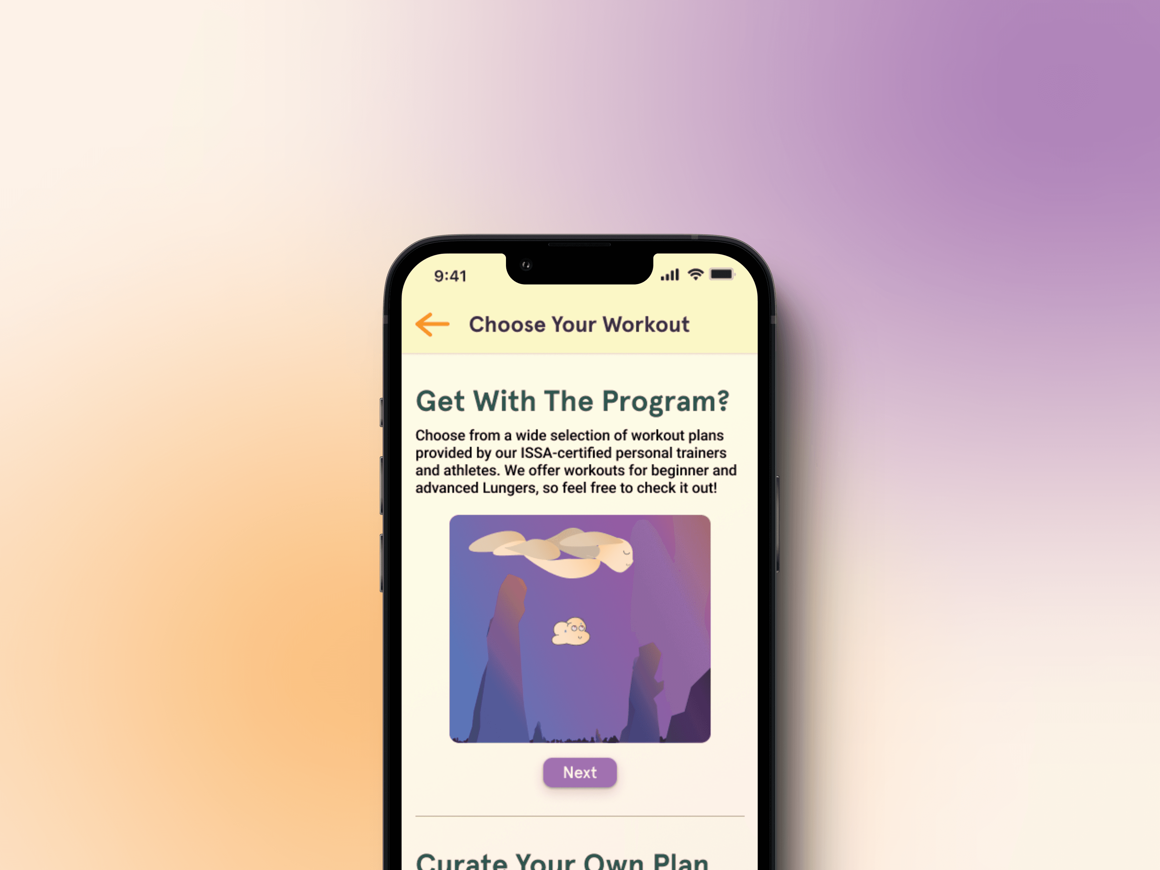
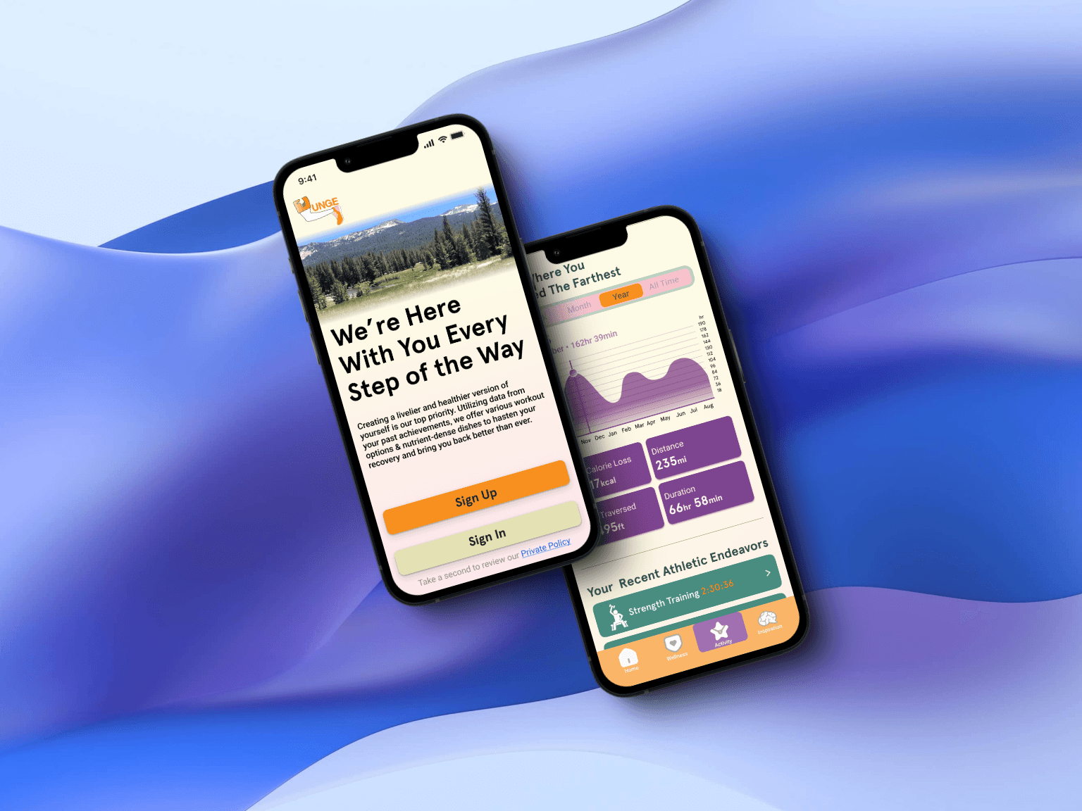
A fitness and wellness app that does not impose a paid subscription upon its users to access important information would, in turn, make the app easily accessible to those who are beginning their fitness journey and who are experienced. Lunge also emphasizes personal development by tracking multiple health metrics in real-time, a feature that accurately estimates one’s overall health. Essentially, this product enables users to attain a healthy lifestyle and offers guidance anyone can easily implement into their routine. Here is a list of the ideas that inspired the creation of Lunge:
Thorough onboarding process to gauge individual goals.
A pedometer display that shows approximate calorie loss.
Options to either create a customized or pre-planned workout.
“Search” and “like” features to quickly access favorite content.
Automatically saves incomplete workouts to revisit another time.


Interviews
Primary Research
I conducted my user surveys entirely online, in which twelve people responded to the prompts I arranged on Google Forms that intended to offer insight into what features they value the most and why they return to their preferred app. I learned that despite 8 of 12 respondents considering themselves highly active, roughly 60% of them still found value in guided workout plans. After concluding the survey, I conducted five interviews in which all interviewees preferred MyFitnessPal for its comprehensive food logging feature. However, all but one of the users I interviewed reported inconsistencies in the nutritional information of certain items.
Secondary Research
When conducting my secondary research, I wished to understand more about what led to the continuance of fitness apps among college students. According to an article on PubMed.com, the results of the qualitative and quantitative studies done by scientists affiliated with the School of International Communications revealed five factors that significantly affected young adults' continuous use of health apps:
Confirmed usefulness
Confirmed ease of use
Satisfaction
Fitness achievement
Social connection
Affinity Mapping
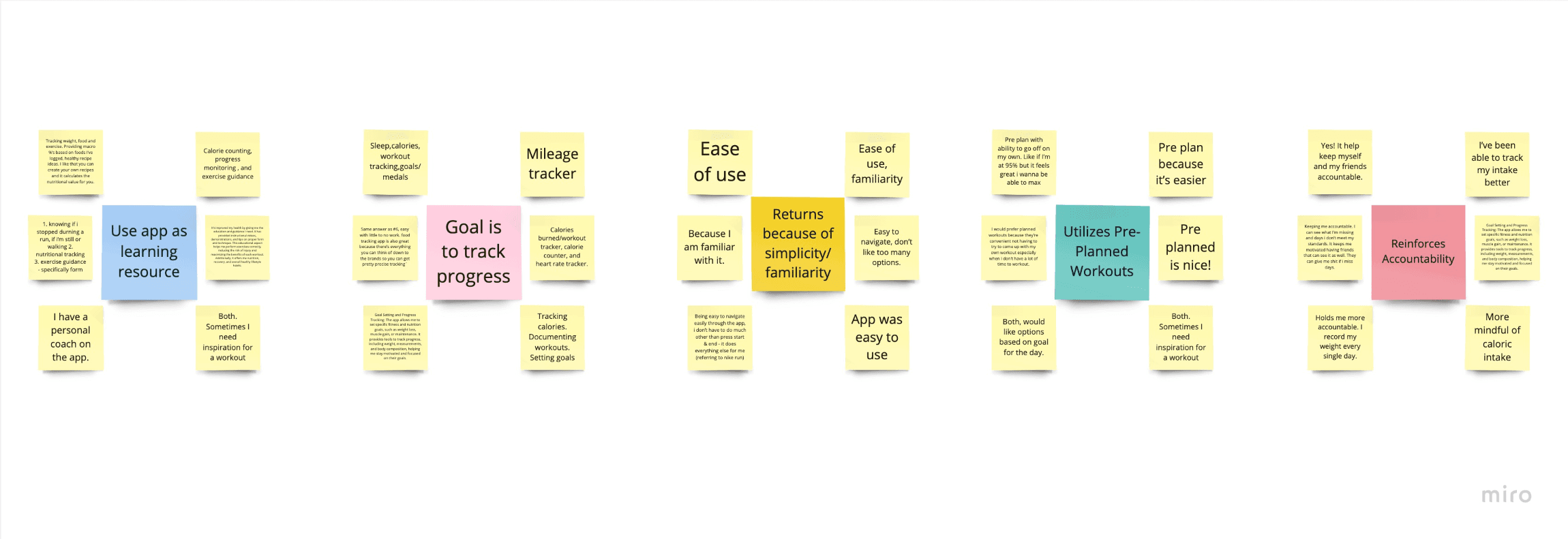
Based on the information gathered from my user interviews and surveys, I then gathered the data into affinity maps. Next I organized the groupings into 5 separate categories:
Use app as learning resource
Goal is to track progress
Returns because of simplicity/familiarity
Utilizes pre-planned workouts
Reinforces Accountability
Competitive Analysis
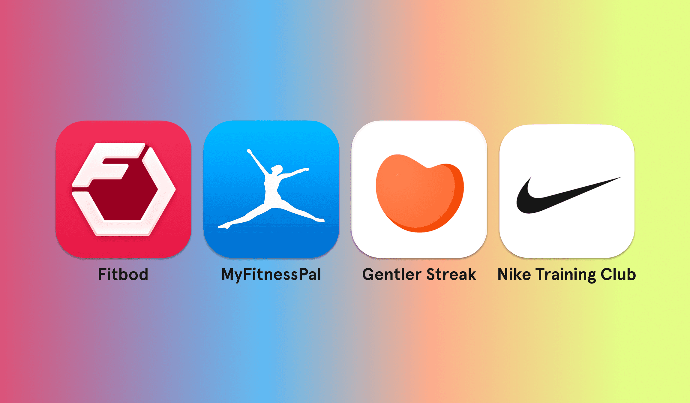
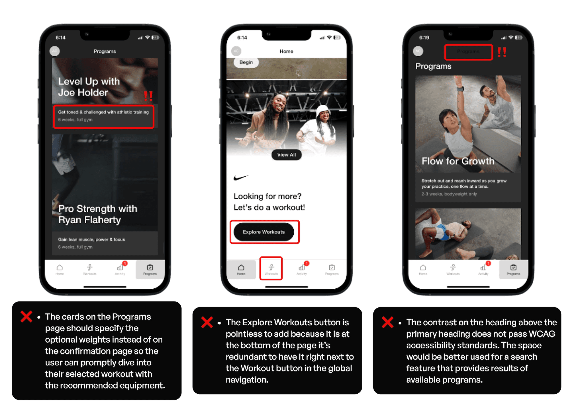
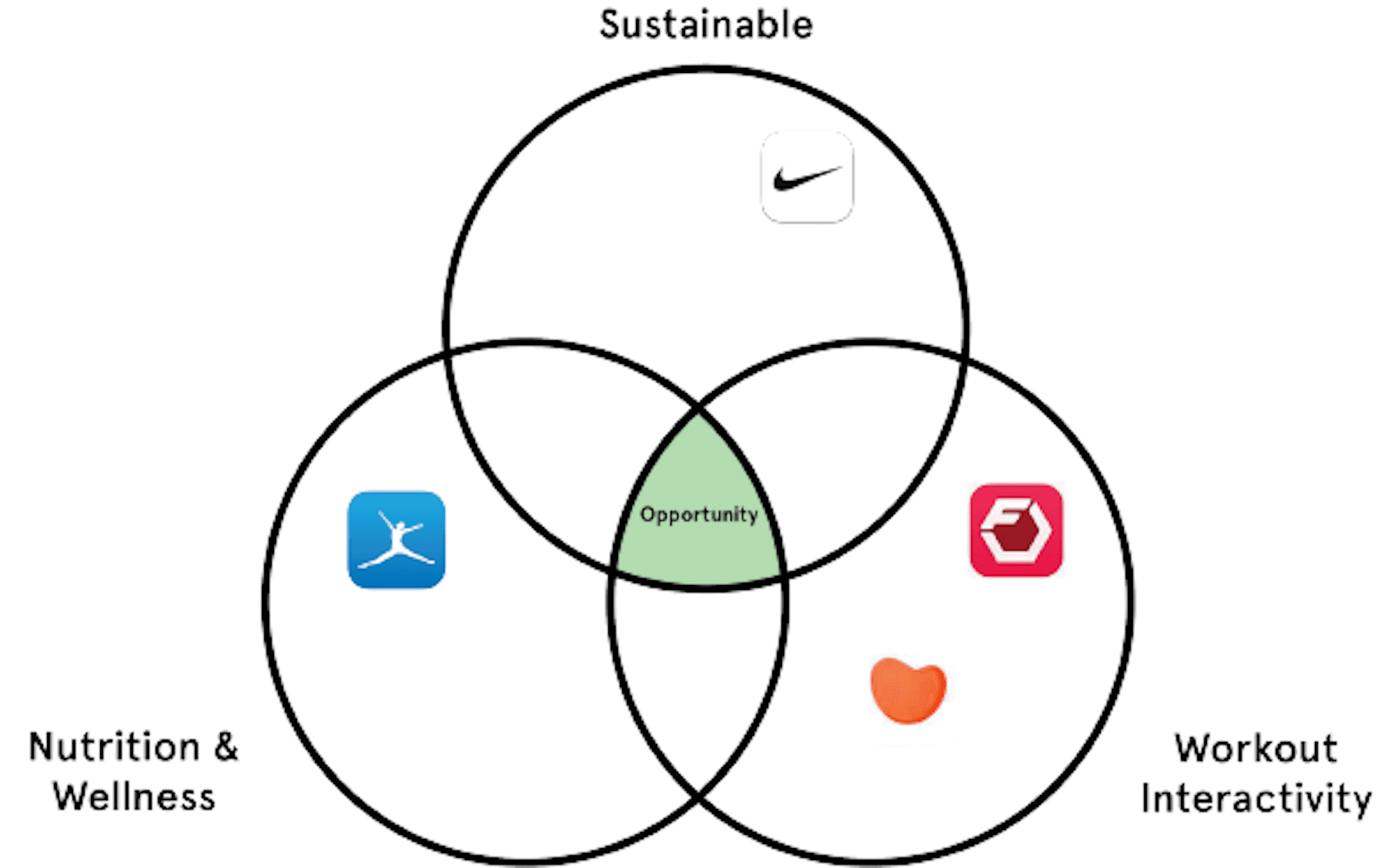
I closely analyzed 4 of the most commonly used fitness apps that all offered partial features that allowed users to monitor their progress, search for guided workout programs, and browse recipe ideas. I considered the areas they were successful in and the obstacles in their UI that may lead to frustration from their users.
Interviews
Primary Research
I conducted my user surveys entirely online, in which twelve people responded to the prompts I arranged on Google Forms that intended to offer insight into what features they value the most and why they return to their preferred app. I learned that despite 8 of 12 respondents considering themselves highly active, roughly 60% of them still found value in guided workout plans. After concluding the survey, I conducted five interviews in which all interviewees preferred MyFitnessPal for its comprehensive food logging feature. However, all but one of the users I interviewed reported inconsistencies in the nutritional information of certain items.
Secondary Research
When conducting my secondary research, I wished to understand more about what led to the continuance of fitness apps among college students. According to an article on PubMed.com, the results of the qualitative and quantitative studies done by scientists affiliated with the School of International Communications revealed five factors that significantly affected young adults' continuous use of health apps:
Confirmed usefulness
Confirmed ease of use
Satisfaction
Fitness achievement
Social connection
Affinity Mapping
Based on the information gathered from my user interviews and surveys, I then gathered the data into affinity maps. Next I organized the groupings into 5 separate categories:
Use app as learning resource
Goal is to track progress
Returns because of simplicity/familiarity
Utilizes pre-planned workouts
Reinforces Accountability

Competitive Analysis
I closely analyzed 4 of the most commonly used fitness apps that all offered partial features that allowed users to monitor their progress, search for guided workout programs, and browse recipe ideas. I considered the areas they were successful in and the obstacles in their UI that may lead to frustration from their users.
Interviews
Primary Research
I conducted my user surveys entirely online, in which twelve people responded to the prompts I arranged on Google Forms that intended to offer insight into what features they value the most and why they return to their preferred app. I learned that despite 8 of 12 respondents considering themselves highly active, roughly 60% of them still found value in guided workout plans. After concluding the survey, I conducted five interviews in which all interviewees preferred MyFitnessPal for its comprehensive food logging feature. However, all but one of the users I interviewed reported inconsistencies in the nutritional information of certain items.
Secondary Research
When conducting my secondary research, I wished to understand more about what led to the continuance of fitness apps among college students. According to an article on PubMed.com, the results of the qualitative and quantitative studies done by scientists affiliated with the School of International Communications revealed five factors that significantly affected young adults' continuous use of health apps:
Confirmed usefulness
Confirmed ease of use
Satisfaction
Fitness achievement
Social connection
Affinity Mapping
Based on the information gathered from my user interviews and surveys, I then gathered the data into affinity maps. Next I organized the groupings into 5 separate categories:
Use app as learning resource
Goal is to track progress
Returns because of simplicity/familiarity
Utilizes pre-planned workouts
Reinforces Accountability

Competitive Analysis
I closely analyzed 4 of the most commonly used fitness apps that all offered partial features that allowed users to monitor their progress, search for guided workout programs, and browse recipe ideas. I considered the areas they were successful in and the obstacles in their UI that may lead to frustration from their users.


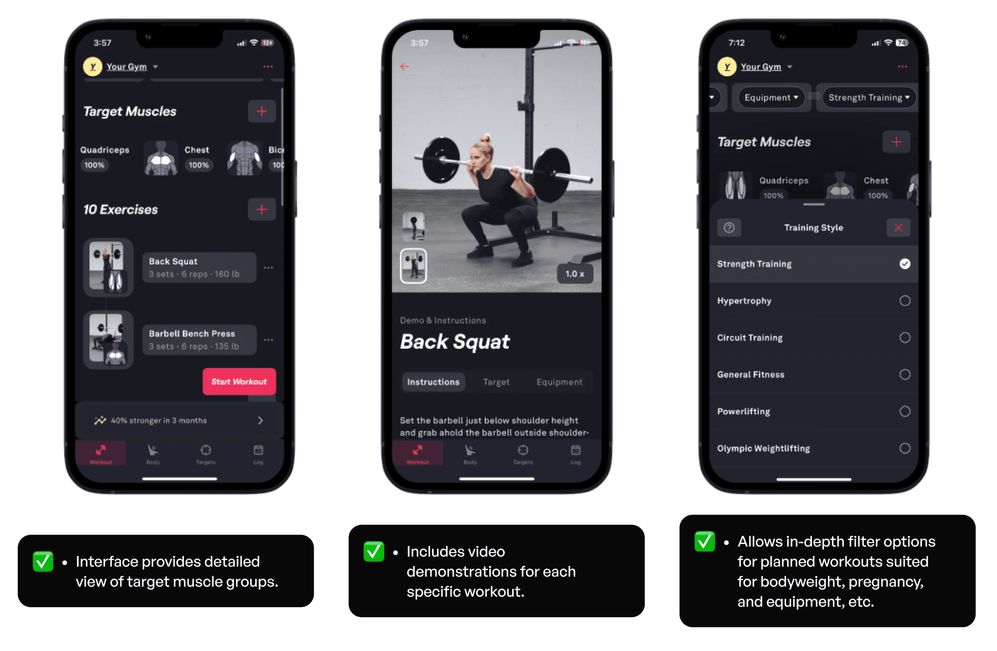
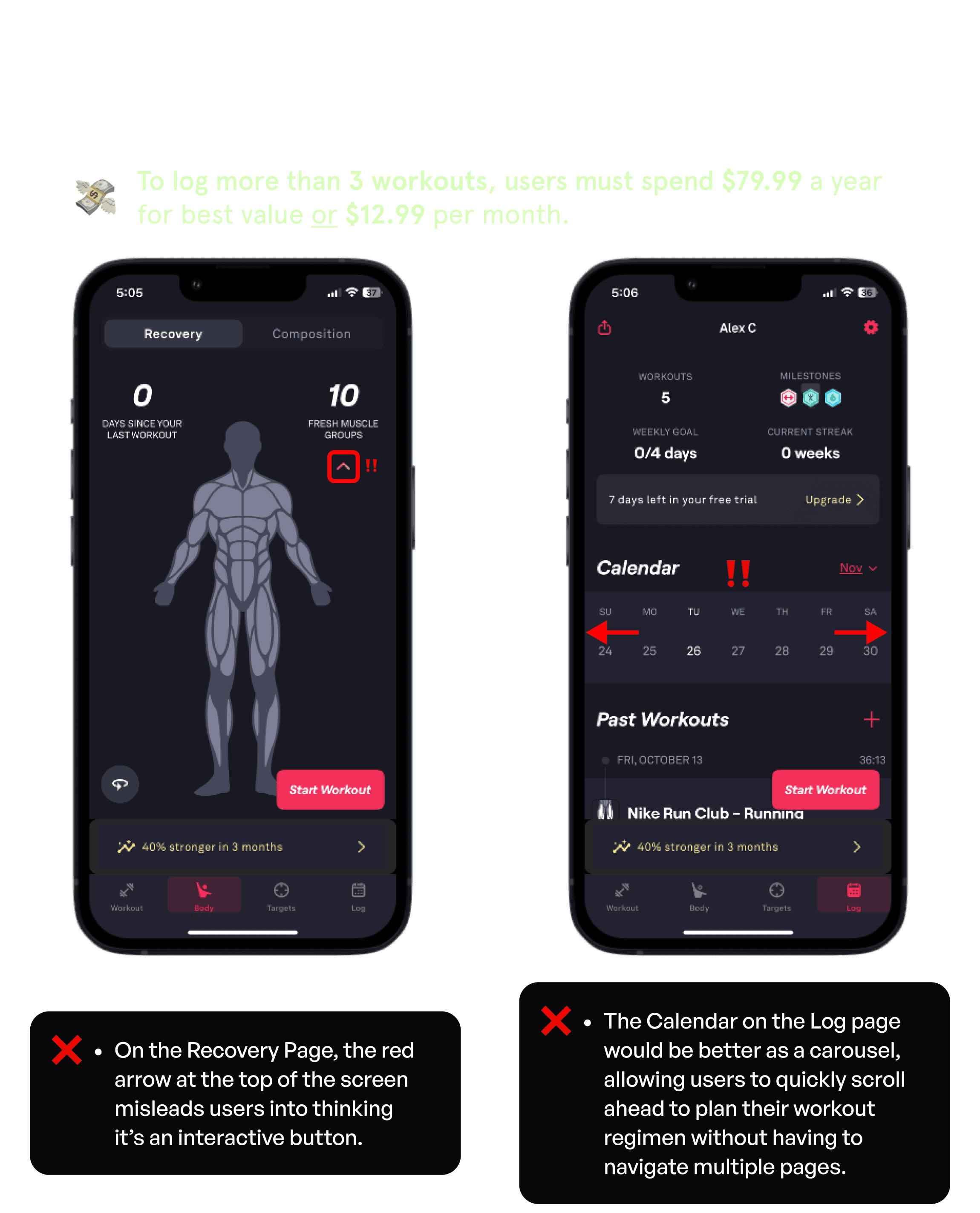
Fitbod
Summary: This exclusive workout app enables users to select target muscle groups and informs them when the respective muscle is fully recovered.
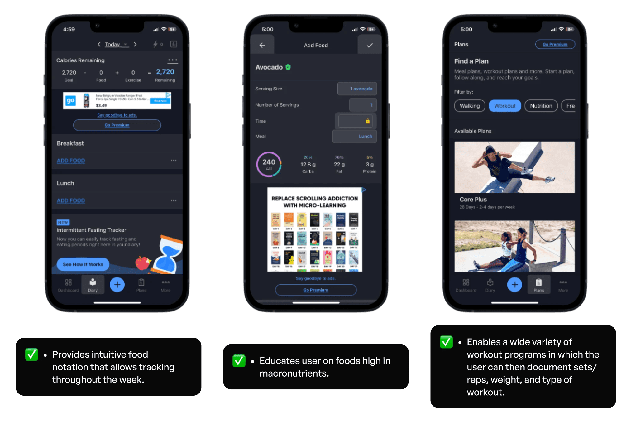
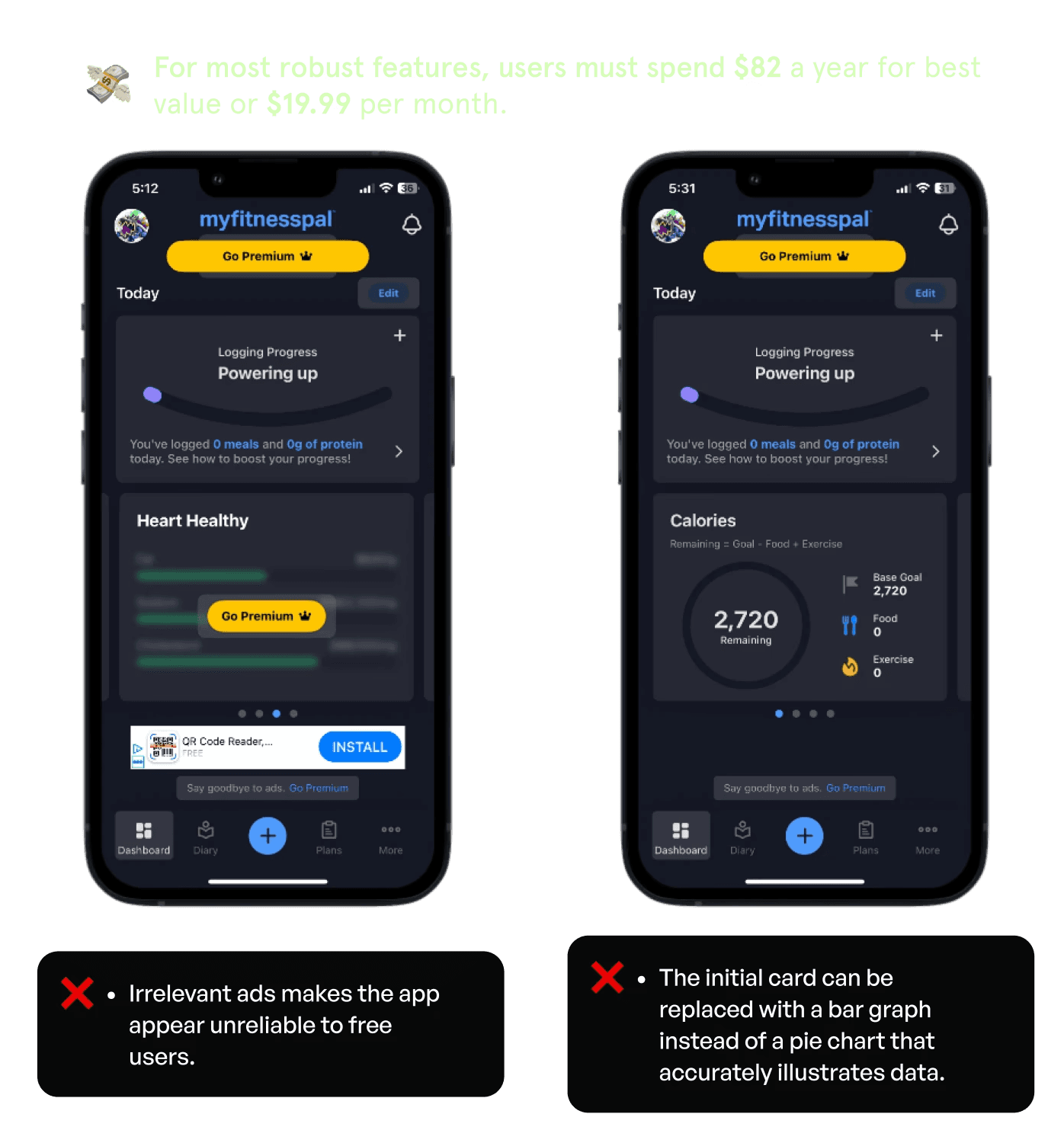
MyFitnessPal
Summary: Free diet and workout tracker that monitors weight, personal goals, and food intake, as well as offers routines and personalized planning options for workouts.
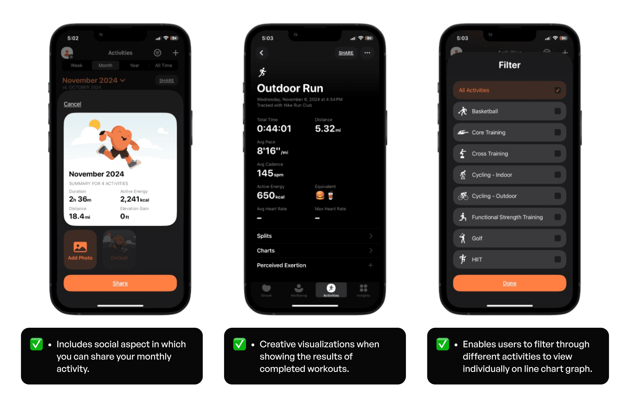
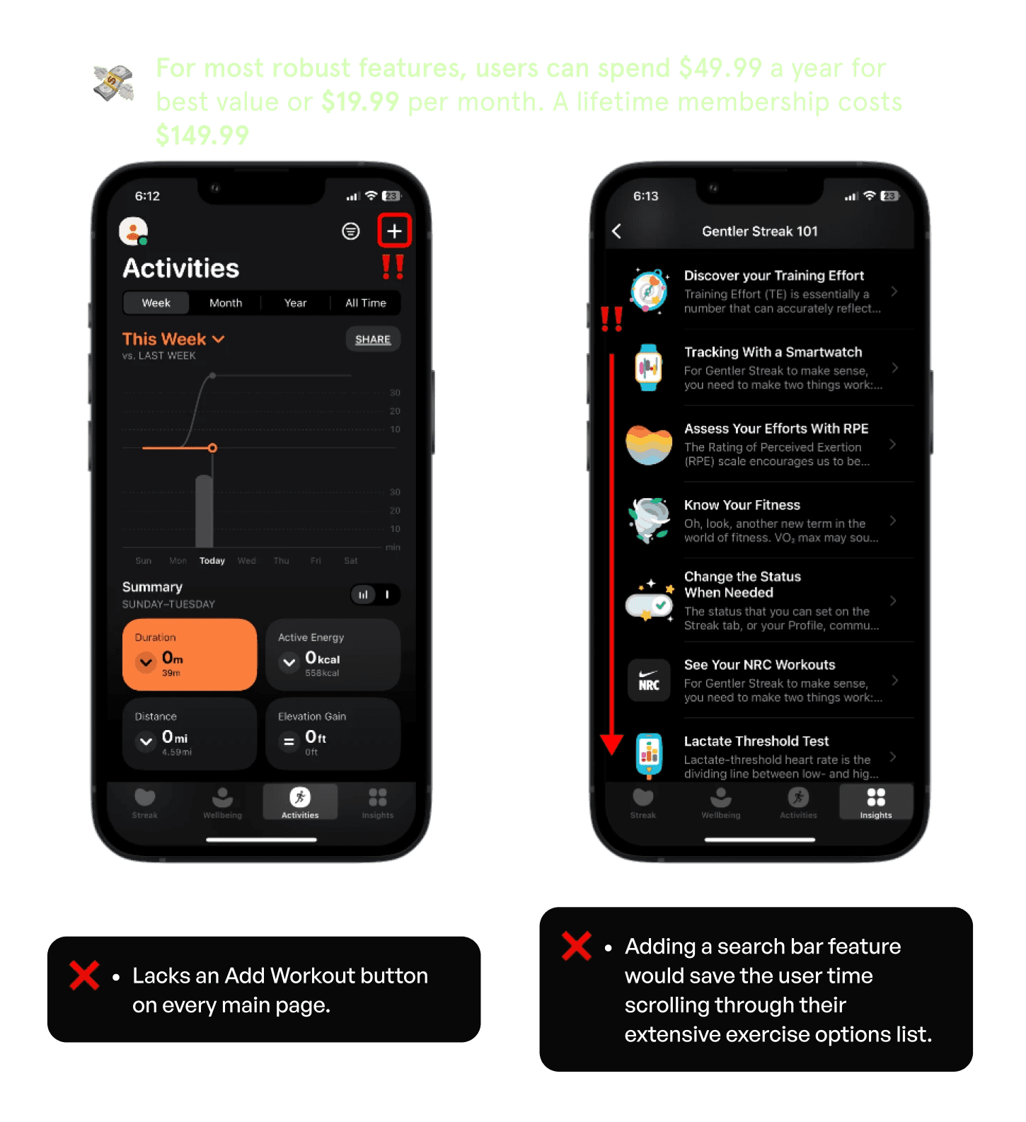
Gentler Streak
Summary: An activity and wellness tracker that provides old health metrics that require a subscription if you wish to update them within the app.
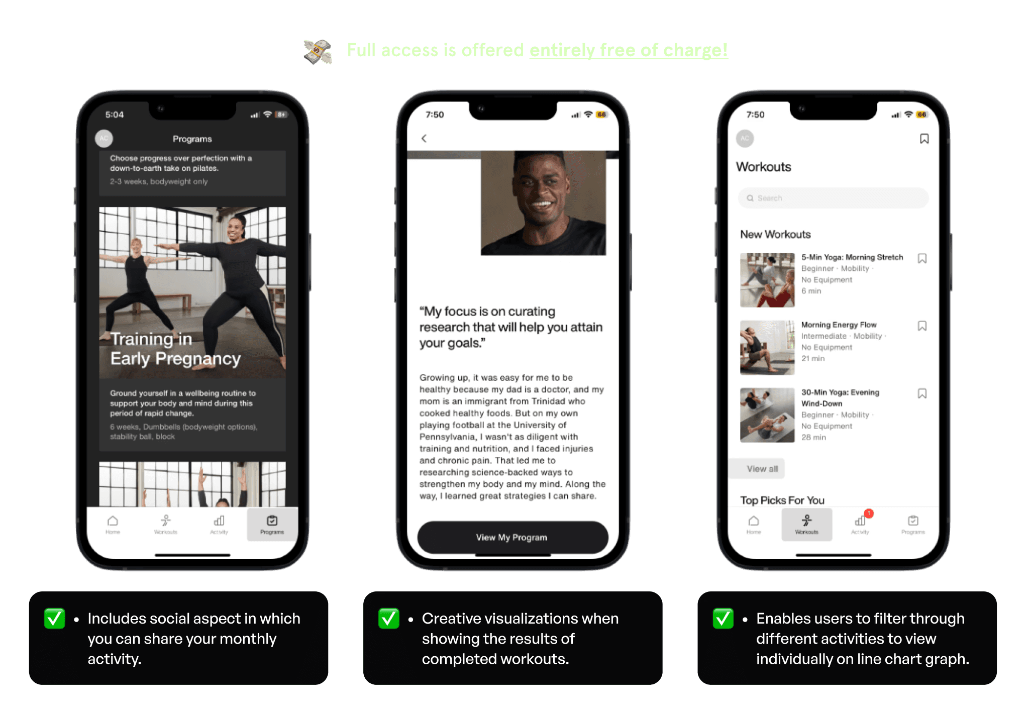
Nike Training Club
Summary: This exclusive workout app enables users to select target muscle groups and informs them when the respective muscle is fully recovered.
Opportunity Framework
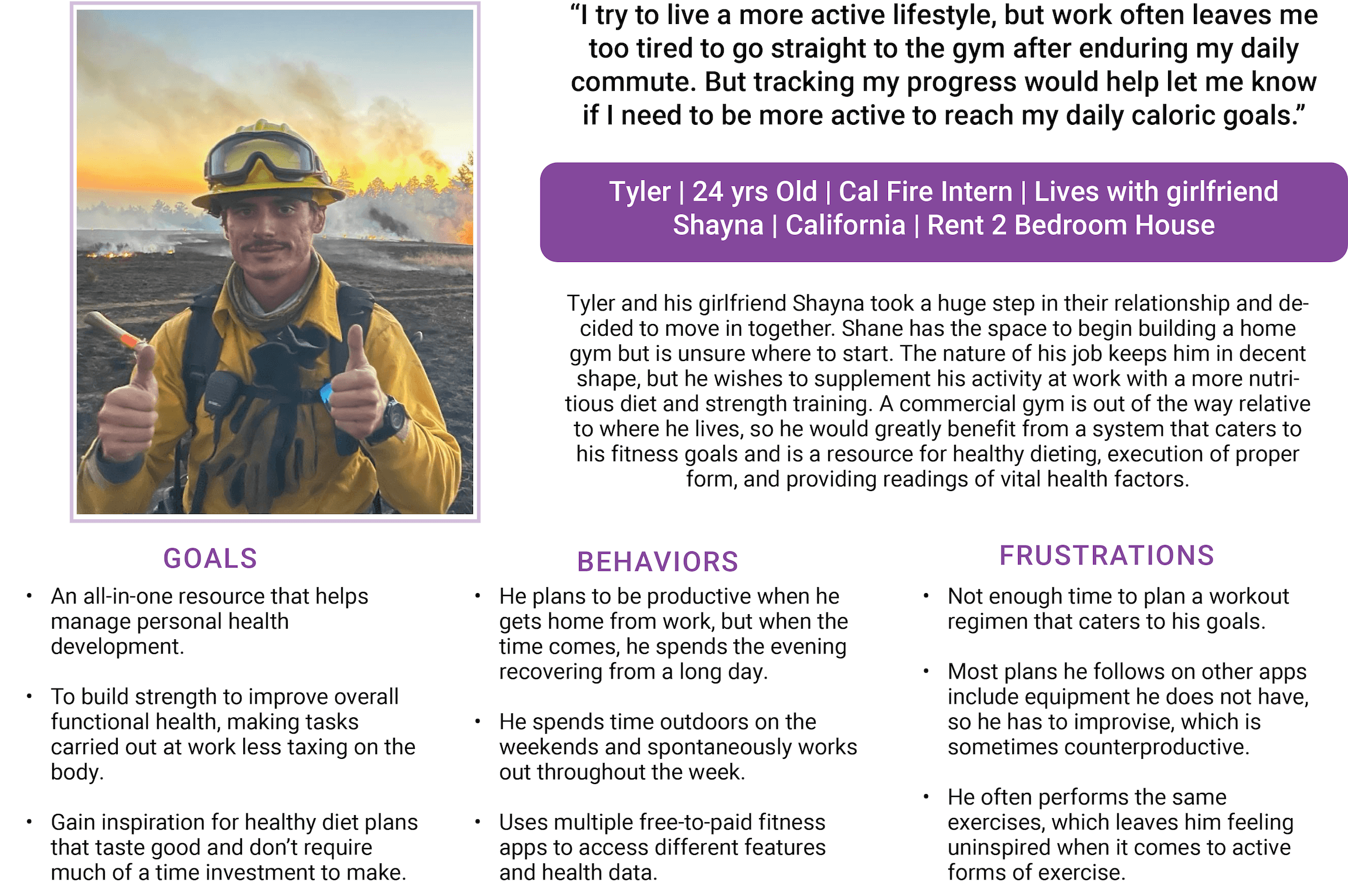
Persona
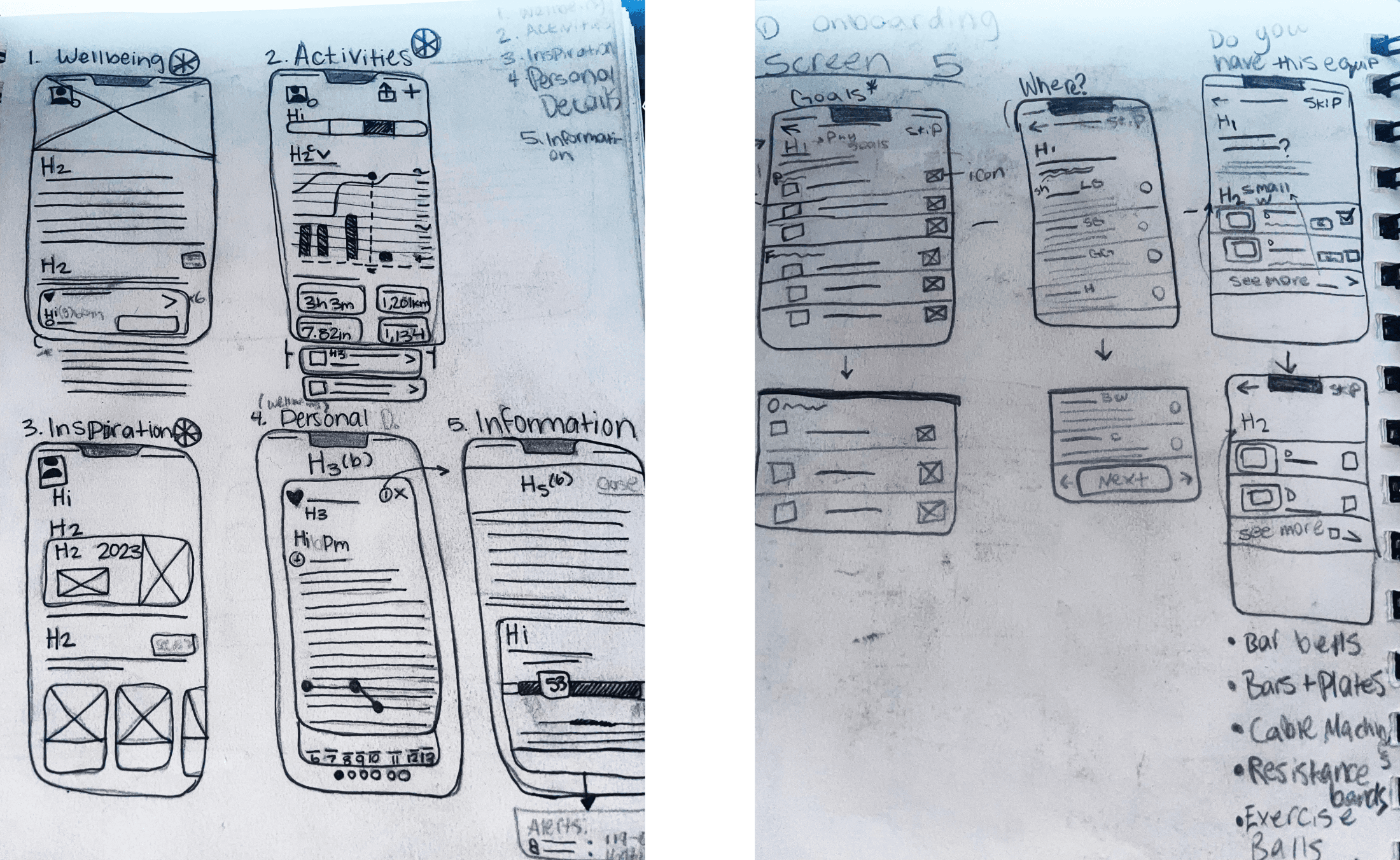
Ideation
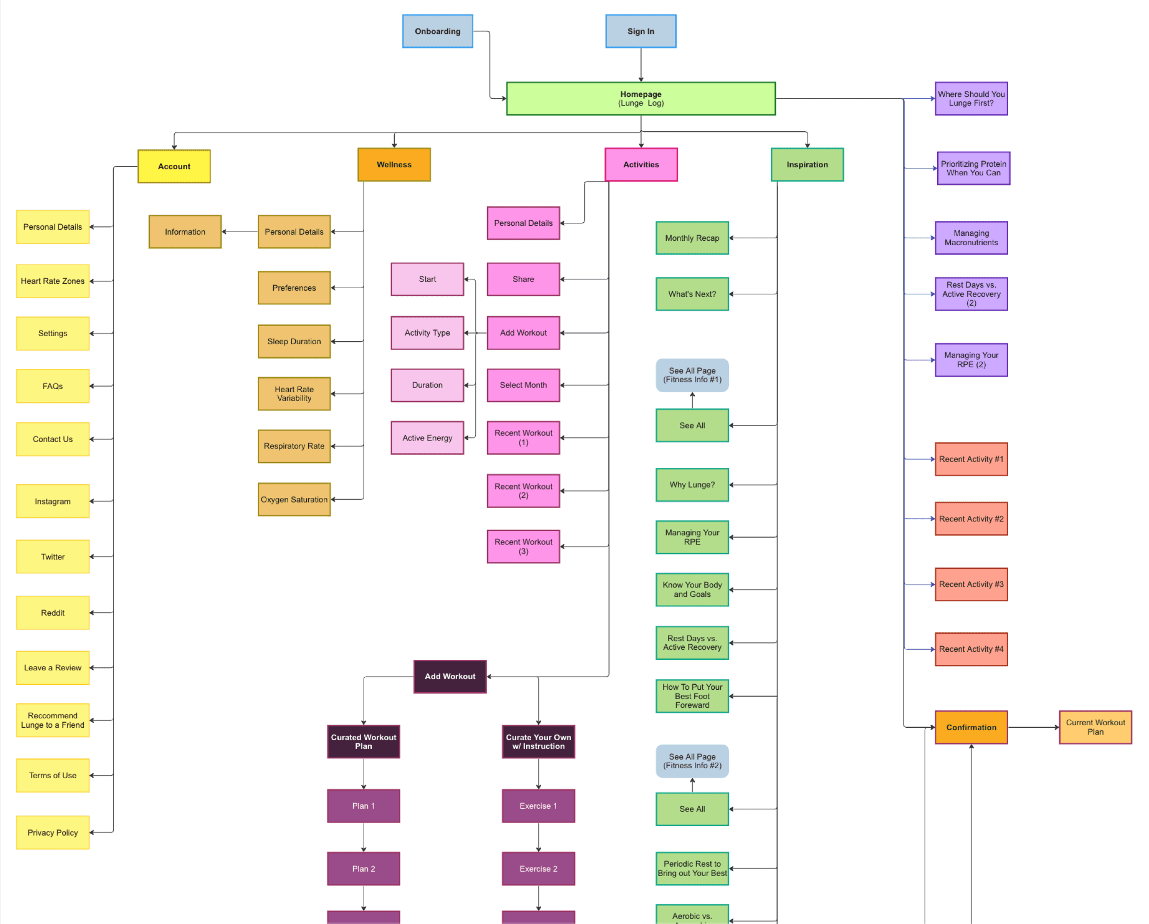
By synthesizing my research, I have gathered enough insights that allowed me to begin exploring different design concepts through sketching rough wireframes. I jotted down ideas and how the screens would look in the high fidelity prototype while also considering the information architecture of the app design once fully fleshed out.
Sitemap
User Flows
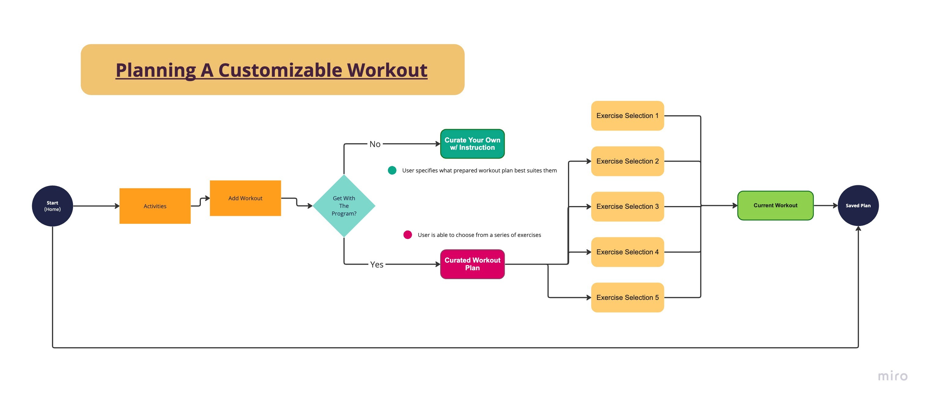
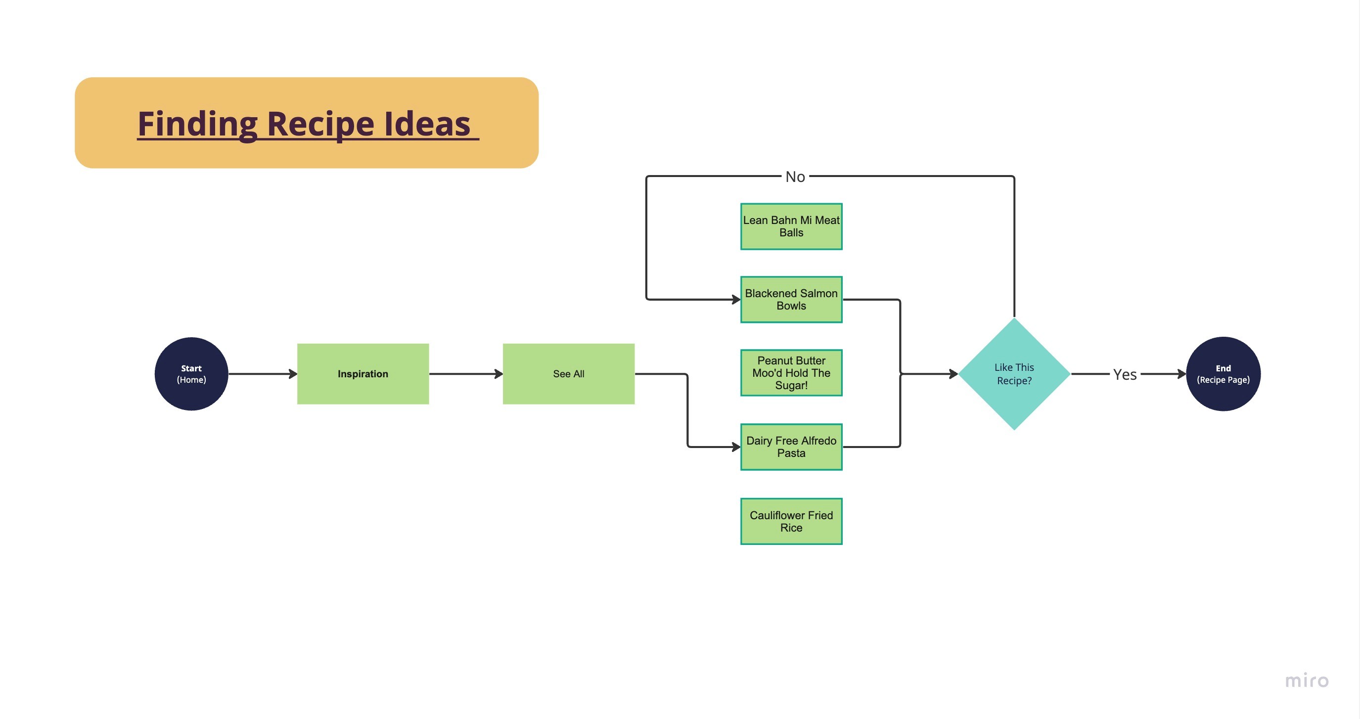
Creating various user flows helps me outline how the user executes multiple tasks within the app. The three main tasks are finding a recipe idea, designing a customizable workout plan, and the onboarding process. Creating these user flows helped me understand how the user would interact with the product and their journey from beginning to end, which would provide indispensable insights into what screens were necessary to incorporate into the final design.
Planning a Workout
Finding a Recipe
Onboarding

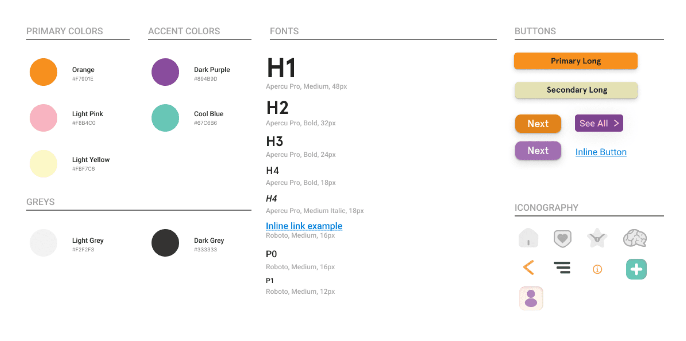
Design System
What I sought to achieve with the creation of this design system was to include a color palette that was unisex and evoked a sense of high energy while using cool colors to also suggest the intimacy of one’s daily routine. Considering the app heavily prioritizes the user’s personal development at varying skill levels, it felt appropriate to use colors that didn’t seem too intense for beginning athletes and softhearted for fitness enthusiasts.
HI-Fidelity Screens
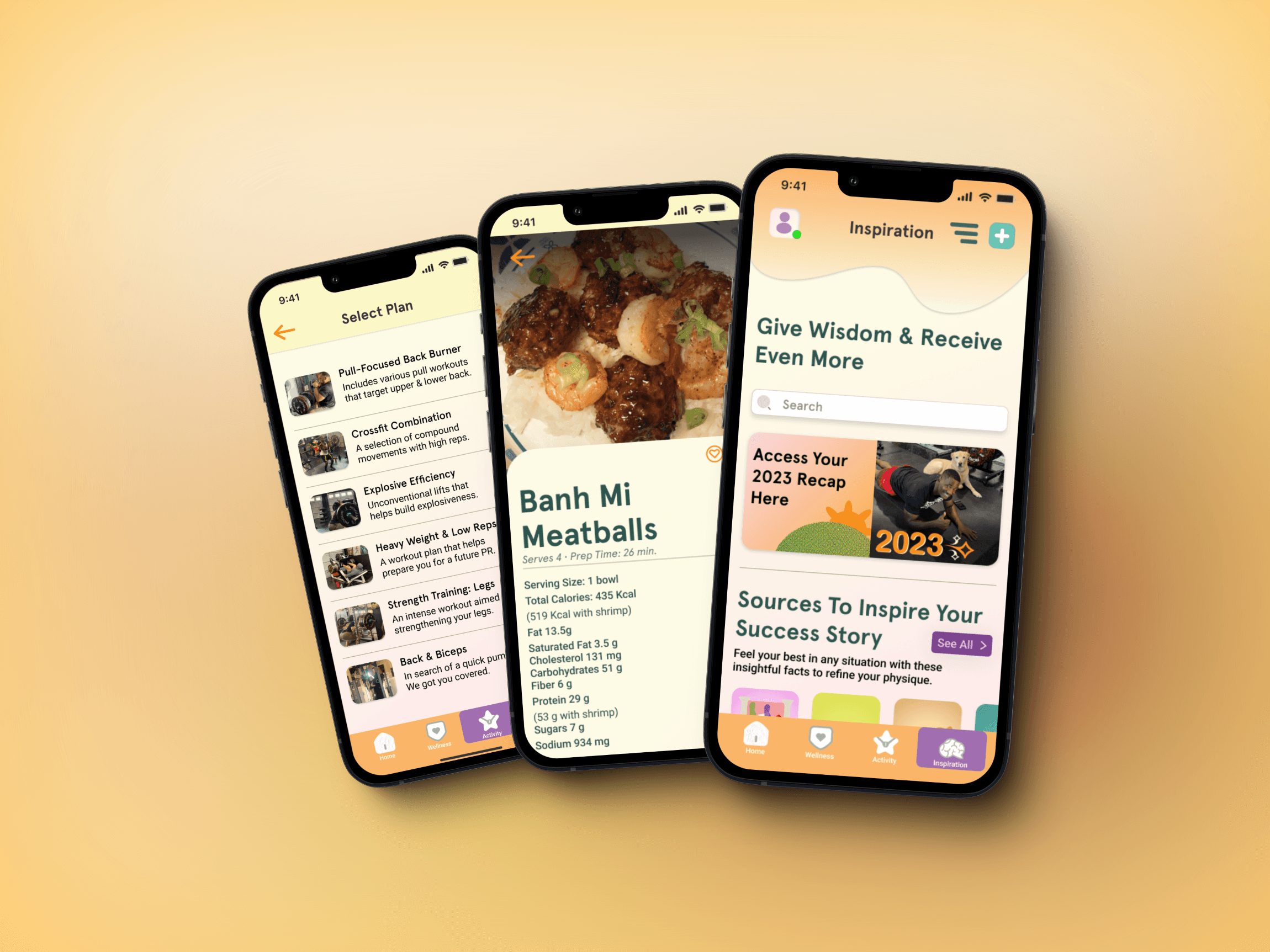
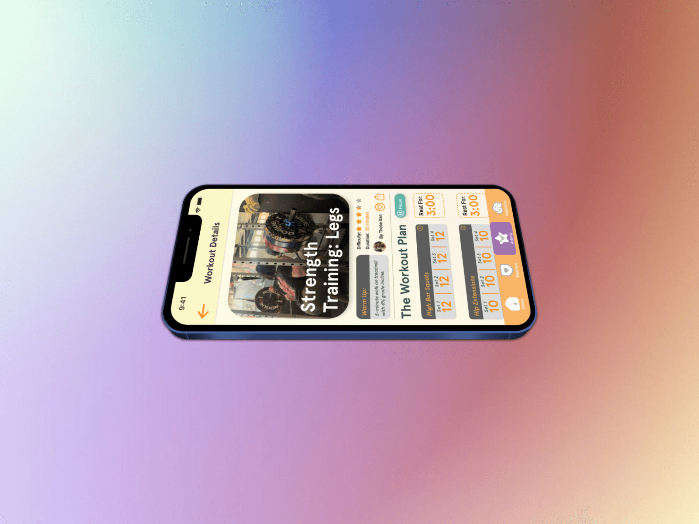
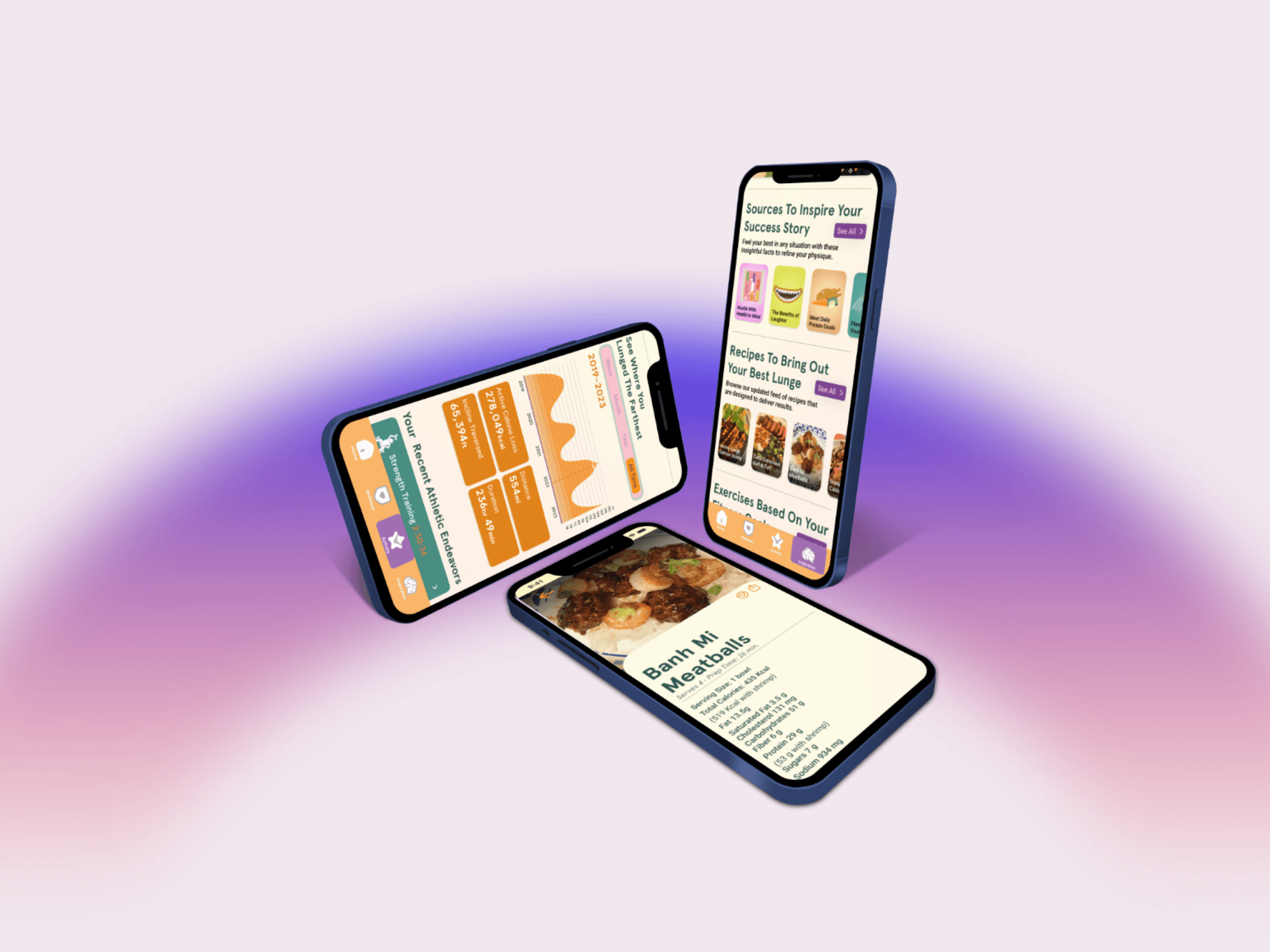
When completing the high-fidelity screens, I changed how the workout details page would look. I initially wanted to have a simple listing of each workout, but I felt it was more appropriate to give each workout its card showing the set and rep range, giving the user a stronger sense of progression. Another minor adjustment I made was how I would present the recipe title. Instead of having it present in the photo's thumbnail, I omitted it from the dish's image so that the user can see the more minor details of the completed dish before cooking the meal.
Reflection
What I learned throughout this project
Considering how daunting it was to conduct the research and design the mobile app prototype while juggling multiple courses, I am eternally grateful to be able to experience the many responsibilities of a UI/UX designer. Due to the time constraints, I had to efficiently manage my time to ensure the deliverables were met by the midterm deadline. Some of what I learned includes:
The implementation skills typical of a UX Designer: This project allowed me to bridge the gap between my skills as a designer and UX researcher. Conducting user interviews was exciting for me because synthesizing the results to inform my design decisions made me feel as if I have the potential to make a positive impact on people’s lives.
Dedicating enough time for each stage of the process: For this project to succeed, I had to manage my time effectively designing assets and creating the UI. Focusing on honing both the soft and hard skills as a designer to see the project through to its completion required me to be methodical in my approach. Prior to designing the UI, I made a significant change in the typefaces I would use for the project that would be best for legibility on small screen sizes.
What’s Next?
Usability Tests: I wish to test my prototype’s usability so I can get a feel for how users navigate the product and make improvements so Lunge requires less guesswork when accessing some of its features.
Optimization of Components: I noticed a couple of areas where components included conditional logic, where I was forced to use a workaround to ensure the user could progress in the prototype. As I continue to bolster my skill set as a designer, specifically in Figma, I wish to revisit the project to optimize the animations in the prototype so that I know without a doubt that the future designs I hand off to developers are of the utmost quality.
Notes
The app designs on this webpage were created in Figma by Alexander Camilli.
I was the sole UX Designer in this project, and created original illustrations, icons, and assets for this product. Thanks for taking the time to read my case study!
Fitbod
Summary: This exclusive workout app enables users to select target muscle groups and informs them when the respective muscle is fully recovered.


MyFitnessPal
Summary: Free diet and workout tracker that monitors weight, personal goals, and food intake, as well as offers routines and personalized planning options for workouts.


Gentler Streak
Summary: An activity and wellness tracker that provides old health metrics that require a subscription if you wish to update them within the app.


Nike Training Club
Summary: This exclusive workout app enables users to select target muscle groups and informs them when the respective muscle is fully recovered.


Opportunity Framework

Persona

Ideation
By synthesizing my research, I have gathered enough insights that allowed me to begin exploring different design concepts through sketching rough wireframes. I jotted down ideas and how the screens would look in the high fidelity prototype while also considering the information architecture of the app design once fully fleshed out.

Sitemap

User Flows
Creating various user flows helps me outline how the user executes multiple tasks within the app. The three main tasks are finding a recipe idea, designing a customizable workout plan, and the onboarding process. Creating these user flows helped me understand how the user would interact with the product and their journey from beginning to end, which would provide indispensable insights into what screens were necessary to incorporate into the final design.
Planning a Workout

Finding a Recipe

Onboarding

Design System
What I sought to achieve with the creation of this design system was to include a color palette that was unisex and evoked a sense of high energy while using cool colors to also suggest the intimacy of one’s daily routine. Considering the app heavily prioritizes the user’s personal development at varying skill levels, it felt appropriate to use colors that didn’t seem too intense for beginning athletes and softhearted for fitness enthusiasts.

HI-Fidelity Screens
When completing the high-fidelity screens, I changed how the workout details page would look. I initially wanted to have a simple listing of each workout, but I felt it was more appropriate to give each workout its card showing the set and rep range, giving the user a stronger sense of progression. Another minor adjustment I made was how I would present the recipe title. Instead of having it present in the photo's thumbnail, I omitted it from the dish's image so that the user can see the more minor details of the completed dish before cooking the meal.

Reflection
What I learned throughout this project
Considering how daunting it was to conduct the research and design the mobile app prototype while juggling multiple courses, I am eternally grateful to be able to experience the many responsibilities of a UI/UX designer. Due to the time constraints, I had to efficiently manage my time to ensure the deliverables were met by the midterm deadline. Some of what I learned includes:
The implementation skills typical of a UX Designer: This project allowed me to bridge the gap between my skills as a designer and UX researcher. Conducting user interviews was exciting for me because synthesizing the results to inform my design decisions made me feel as if I have the potential to make a positive impact on people’s lives.
Dedicating enough time for each stage of the process: For this project to succeed, I had to manage my time effectively designing assets and creating the UI. Focusing on honing both the soft and hard skills as a designer to see the project through to its completion required me to be methodical in my approach. Prior to designing the UI, I made a significant change in the typefaces I would use for the project that would be best for legibility on small screen sizes.
What’s Next?
Usability Tests: I wish to test my prototype’s usability so I can get a feel for how users navigate the product and make improvements so Lunge requires less guesswork when accessing some of its features.
Optimization of Components: I noticed a couple of areas where components included conditional logic, where I was forced to use a workaround to ensure the user could progress in the prototype. As I continue to bolster my skill set as a designer, specifically in Figma, I wish to revisit the project to optimize the animations in the prototype so that I know without a doubt that the future designs I hand off to developers are of the utmost quality.
Notes
The app designs on this webpage were created in Figma by Alexander Camilli.
I was the sole UX Designer in this project, and created original illustrations, icons, and assets for this product. Thanks for taking the time to read my case study!
Fitbod
Summary: This exclusive workout app enables users to select target muscle groups and informs them when the respective muscle is fully recovered.


MyFitnessPal
Summary: Free diet and workout tracker that monitors weight, personal goals, and food intake, as well as offers routines and personalized planning options for workouts.


Gentler Streak
Summary: An activity and wellness tracker that provides old health metrics that require a subscription if you wish to update them within the app.


Nike Training Club
Summary: This exclusive workout app enables users to select target muscle groups and informs them when the respective muscle is fully recovered.


Opportunity Framework

Persona

Ideation
By synthesizing my research, I have gathered enough insights that allowed me to begin exploring different design concepts through sketching rough wireframes. I jotted down ideas and how the screens would look in the high fidelity prototype while also considering the information architecture of the app design once fully fleshed out.

Sitemap

User Flows
Creating various user flows helps me outline how the user executes multiple tasks within the app. The three main tasks are finding a recipe idea, designing a customizable workout plan, and the onboarding process. Creating these user flows helped me understand how the user would interact with the product and their journey from beginning to end, which would provide indispensable insights into what screens were necessary to incorporate into the final design.
Planning a Workout

Finding a Recipe

Onboarding

Design System
What I sought to achieve with the creation of this design system was to include a color palette that was unisex and evoked a sense of high energy while using cool colors to also suggest the intimacy of one’s daily routine. Considering the app heavily prioritizes the user’s personal development at varying skill levels, it felt appropriate to use colors that didn’t seem too intense for beginning athletes and softhearted for fitness enthusiasts.

HI-Fidelity Screens
When completing the high-fidelity screens, I changed how the workout details page would look. I initially wanted to have a simple listing of each workout, but I felt it was more appropriate to give each workout its card showing the set and rep range, giving the user a stronger sense of progression. Another minor adjustment I made was how I would present the recipe title. Instead of having it present in the photo's thumbnail, I omitted it from the dish's image so that the user can see the more minor details of the completed dish before cooking the meal.

Reflection
What I learned throughout this project
Considering how daunting it was to conduct the research and design the mobile app prototype while juggling multiple courses, I am eternally grateful to be able to experience the many responsibilities of a UI/UX designer. Due to the time constraints, I had to efficiently manage my time to ensure the deliverables were met by the midterm deadline. Some of what I learned includes:
The implementation skills typical of a UX Designer: This project allowed me to bridge the gap between my skills as a designer and UX researcher. Conducting user interviews was exciting for me because synthesizing the results to inform my design decisions made me feel as if I have the potential to make a positive impact on people’s lives.
Dedicating enough time for each stage of the process: For this project to succeed, I had to manage my time effectively designing assets and creating the UI. Focusing on honing both the soft and hard skills as a designer to see the project through to its completion required me to be methodical in my approach. Prior to designing the UI, I made a significant change in the typefaces I would use for the project that would be best for legibility on small screen sizes.
What’s Next?
Usability Tests: I wish to test my prototype’s usability so I can get a feel for how users navigate the product and make improvements so Lunge requires less guesswork when accessing some of its features.
Optimization of Components: I noticed a couple of areas where components included conditional logic, where I was forced to use a workaround to ensure the user could progress in the prototype. As I continue to bolster my skill set as a designer, specifically in Figma, I wish to revisit the project to optimize the animations in the prototype so that I know without a doubt that the future designs I hand off to developers are of the utmost quality.
Notes
The app designs on this webpage were created in Figma by Alexander Camilli.
I was the sole UX Designer in this project, and created original illustrations, icons, and assets for this product. Thanks for taking the time to read my case study!