


Arbor
Arbor
Arbor
Logo & Branding Presentation
Logo & Branding Presentation
Logo & Branding Presentation


Overview
Overview
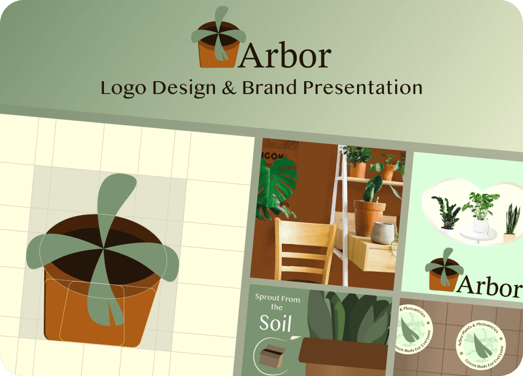
Arbor Plants & Pleasantries is an e-commerce platform in which customers can educate themselves and purchase plants online. Considering how customers of numerous age ranges are gravitating towards online shopping, this product would be competitive in it’s respective market due to the lack of practical information and variety of factors when purchasing plants in-person.
Arbor Plants & Pleasantries is an e-commerce platform in which customers can educate themselves and purchase plants online. Considering how customers of numerous age ranges are gravitating towards online shopping, this product would be competitive in it’s respective market due to the lack of practical information and variety of factors when purchasing plants in-person.
Arbor Plants & Pleasantries is an e-commerce platform in which customers can educate themselves and purchase plants online. Considering how customers of numerous age ranges are gravitating towards online shopping, this product would be competitive in it’s respective market due to the lack of practical information and variety of factors when purchasing plants in-person.
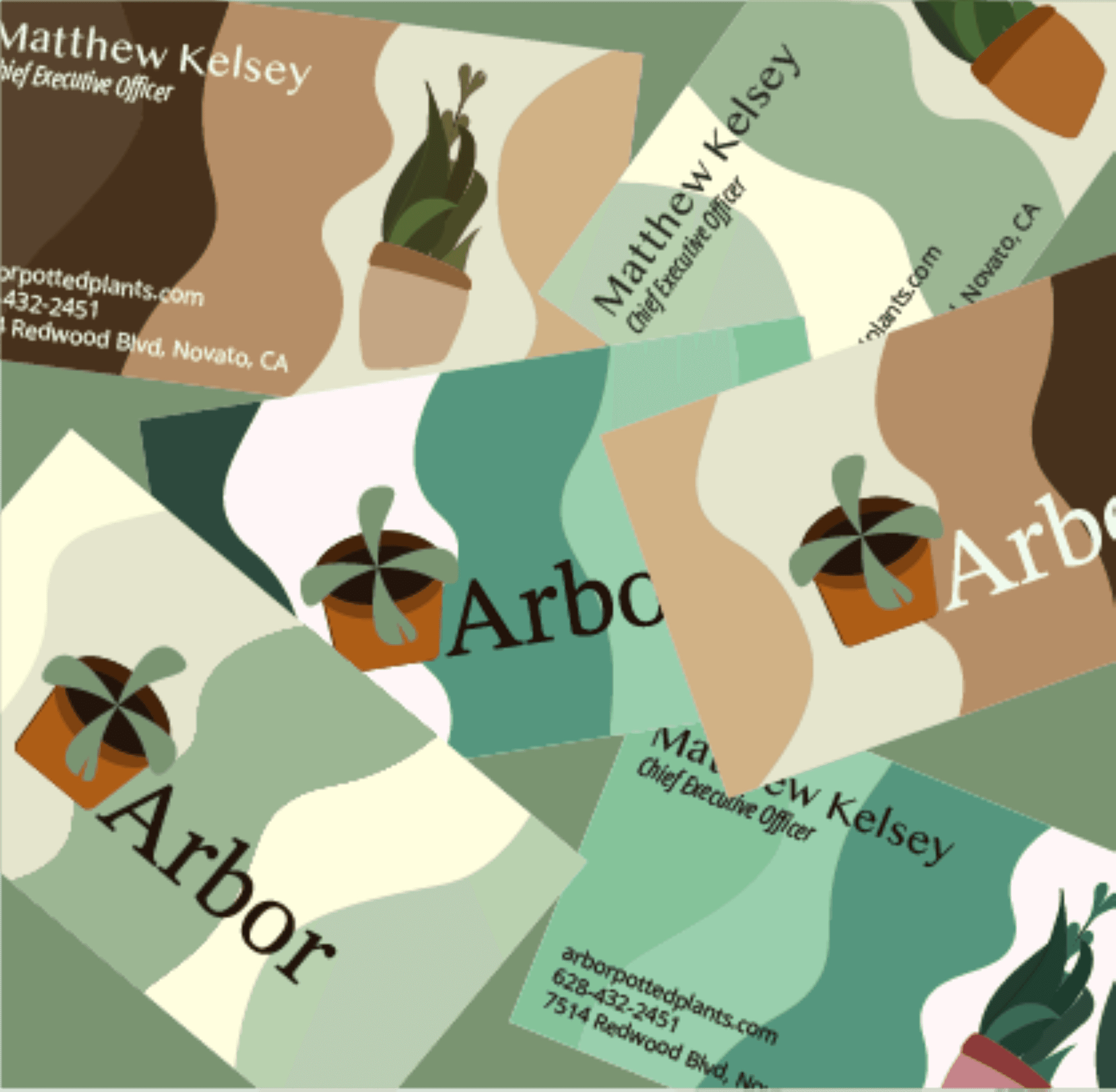
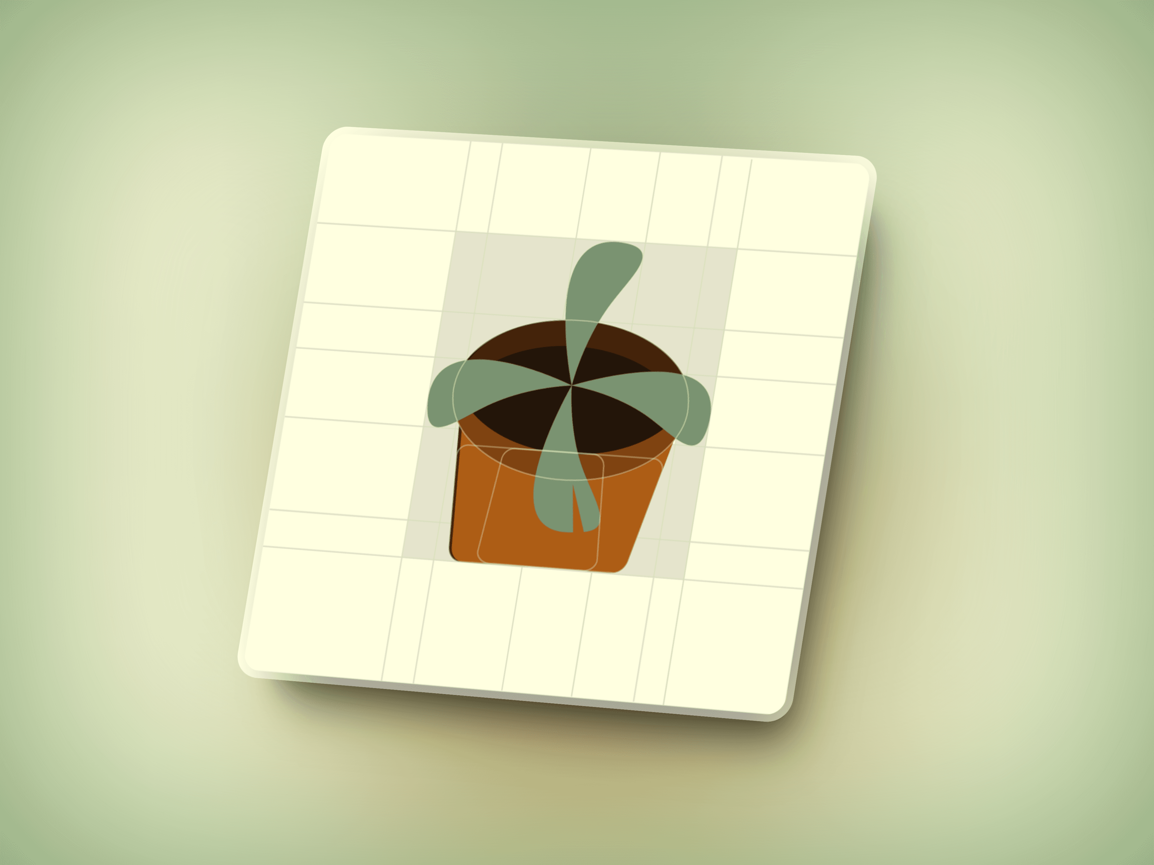
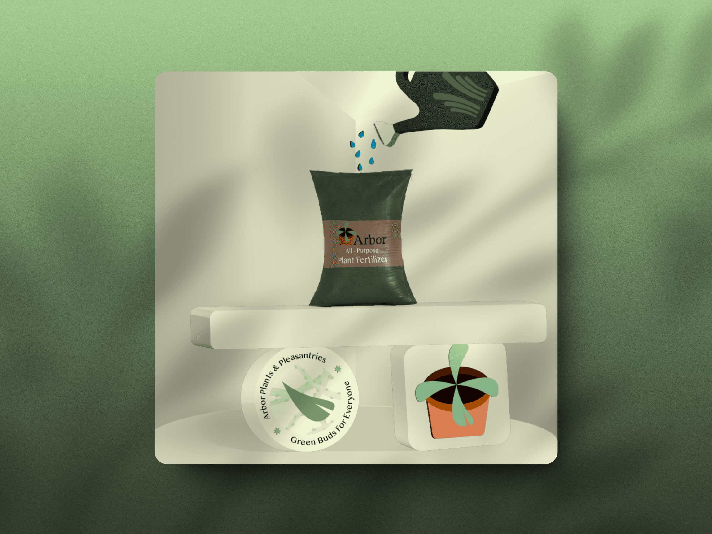
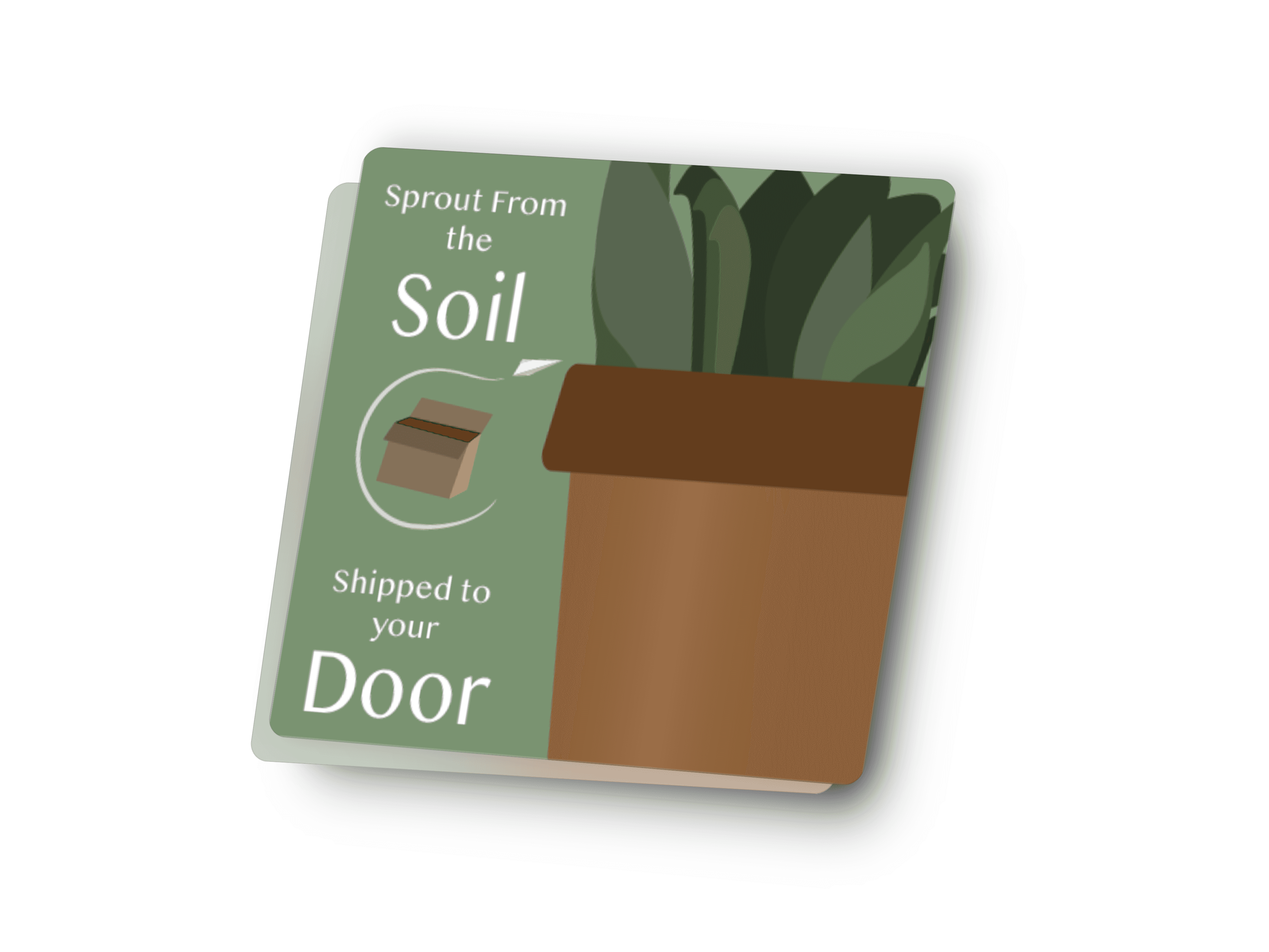
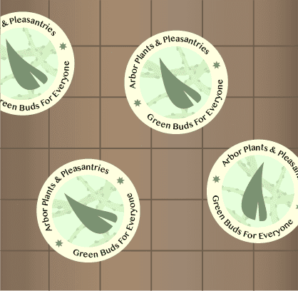
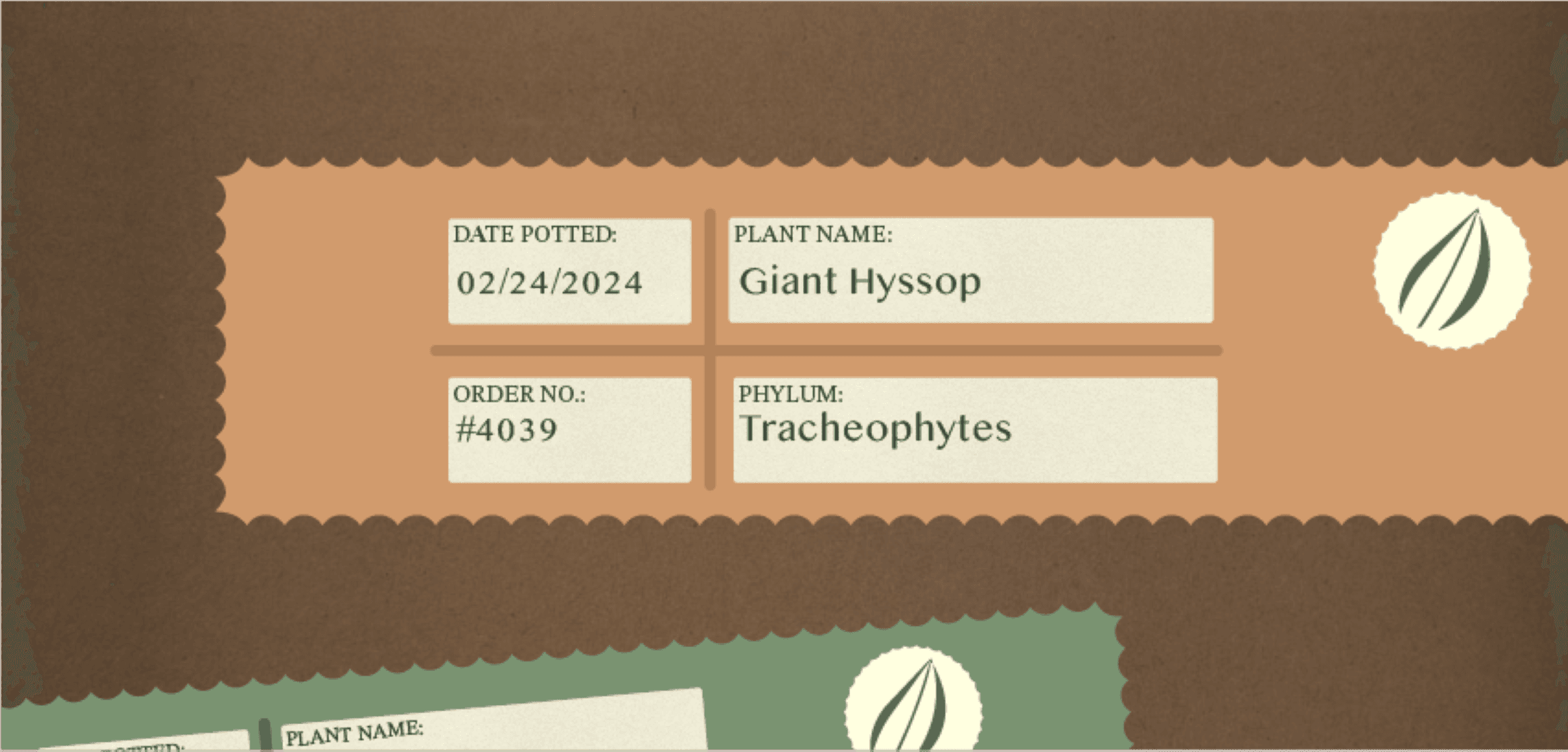
When deciding the branding aesthetic for Arbor, I envisioned the use of a neutral color palette for the logo and promotional content design. Green is a color that is prevalent in nature, and desaturated orange is often the color of terracotta pottery used to house plants. As an e-commerce plant nursery, the visuals would resonate with Arbor’s target audience which includes adults between the ages of 28 and 40 that wish to purchase plants from the comfort of their own home. The typefaces I’ve chosen consist of STIX Two Math, Oriya MN, and Open Sans. The relationship between the sans serif and serif fonts are used tastefully to evoke a sense of tranquility, modernism, and delightfulness of welcoming new flora into the household.
When deciding the branding aesthetic for Arbor, I envisioned the use of a neutral color palette for the logo and promotional content design. Green is a color that is prevalent in nature, and desaturated orange is often the color of terracotta pottery used to house plants. As an e-commerce plant nursery, the visuals would resonate with Arbor’s target audience which includes adults between the ages of 28 and 40 that wish to purchase plants from the comfort of their own home. The typefaces I’ve chosen consist of STIX Two Math, Oriya MN, and Open Sans. The relationship between the sans serif and serif fonts are used tastefully to evoke a sense of tranquility, modernism, and delightfulness of welcoming new flora into the household.
When deciding the branding aesthetic for Arbor, I envisioned the use of a neutral color palette for the logo and promotional content design. Green is a color that is prevalent in nature, and desaturated orange is often the color of terracotta pottery used to house plants. As an e-commerce plant nursery, the visuals would resonate with Arbor’s target audience which includes adults between the ages of 28 and 40 that wish to purchase plants from the comfort of their own home. The typefaces I’ve chosen consist of STIX Two Math, Oriya MN, and Open Sans. The relationship between the sans serif and serif fonts are used tastefully to evoke a sense of tranquility, modernism, and delightfulness of welcoming new flora into the household.


Tech Stack

Figma
Design Tool
Tech Stack

Figma
Design Tool
Tech Stack

Figma
Design Tool
Created
Created
2023
2023








Notes
All of the designs featured in this presentation was designed solely by Alex Camilli in Adobe Illustrator, and arranged in Figma. Thanks for taking the time to visit!

Notes
All of the designs featured in this presentation was designed solely by Alex Camilli in Adobe Illustrator, and arranged in Figma. Thanks for taking the time to visit!

Notes
All of the designs featured in this presentation was designed solely by Alex Camilli in Adobe Illustrator, and arranged in Figma. Thanks for taking the time to visit!