


BTFY (Butterfly)
BTFY (Butterfly)
BTFY (Butterfly)
iOS App
iOS App
iOS App


Overview
Overview
There have been substantial evidence to support the lack of BIPOC representation in tech-related roles, with African Americans representing only 7% of the tech workforce. This statistic signifies how essential establishing a network and community is for gaining the skills necessary to access professional tech spaces, especially for under-resourced populations of people.
There have been substantial evidence to support the lack of BIPOC representation in tech-related roles, with African Americans representing only 7% of the tech workforce. This statistic signifies how essential establishing a network and community is for gaining the skills necessary to access professional tech spaces, especially for under-resourced populations of people.
There have been substantial evidence to support the lack of BIPOC representation in tech-related roles, with African Americans representing only 7% of the tech workforce. This statistic signifies how essential establishing a network and community is for gaining the skills necessary to access professional tech spaces, especially for under-resourced populations of people.
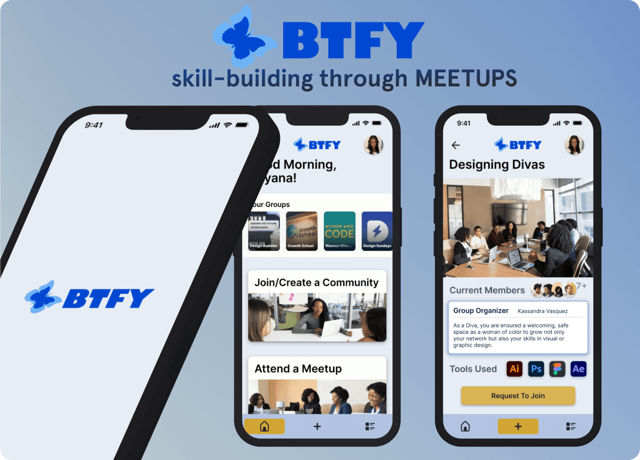
BTFY enables BIPOC students and professionals of design/tech roles access to facilitating communities where they can collectively network, skill-share, and educate their contemporaries.
BTFY enables BIPOC students and professionals of design/tech roles access to facilitating communities where they can collectively network, skill-share, and educate their contemporaries.
BTFY enables BIPOC students and professionals of design/tech roles access to facilitating communities where they can collectively network, skill-share, and educate their contemporaries.


Tech Stack
Figma
Design Tool
Tech Stack

Figma
Design Tool
Tech Stack

Figma
Design Tool
Created
Created
2024 (3 Week Design Sprint)
2024 (3 Week Design Sprint)


Process
Process
How might we create environments that support BIPOC students’ journey gaining the necessary skills to succeed and thrive in design/tech related roles?
Constructing our Problem Statement
There has always been a perpetually limited pool of BIPOC degree earners employed in the tech industry, and this lack of representation often leaves students unsure if the career path is actually feasible for them. College transfer students experience increased uncertainty in establishing a career pathway considering they are often without a community or mentor to learn how to navigate their desired career.
Proposing an Effective Solution
Introducing a digital tool that facilitates gatherings with an emphasis on professional development would prove beneficial for under-resourced students. Prioritizing safety above all else, BIPOC students can create safe spaces to pass on accumulated skills or learn from seasoned design professionals. Butterfly (BTFY) acknowledges the anxieties of committing to a group, and offers public meetups free of continuous involvement. Additional features include:
A career directory to learn to explore career options.
Thorough onboarding form for applicants to ensure safety and productivity.
Map featuring nearby groups based on current location.
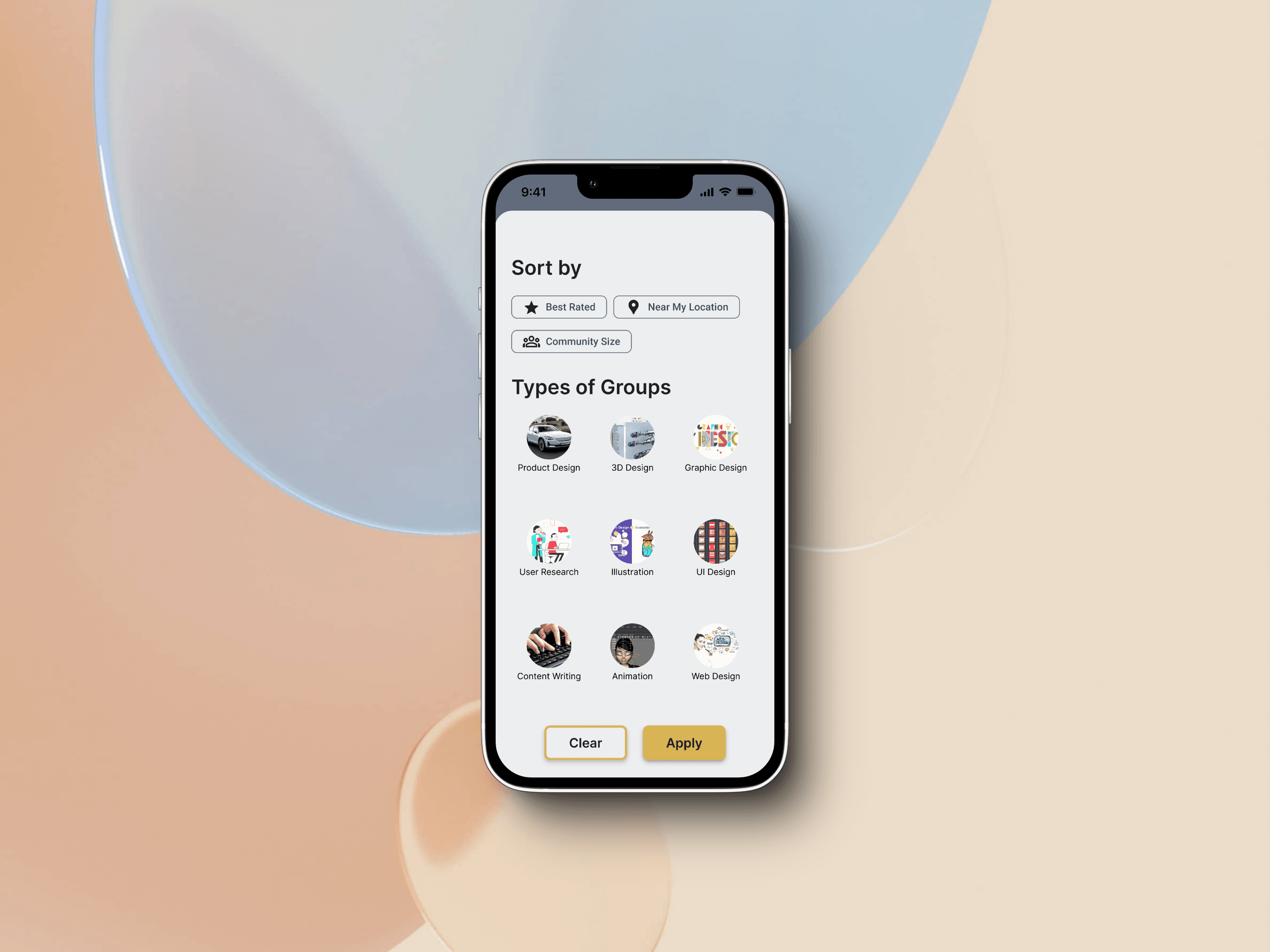
“Sort” and “Filter” feature that uses chips to specify career interests.

Interviews
Primary Research: User Interviews
My team and I conducted 17 user interviews and to learn more about our target users’ pain points, motivations, and obstacles when pursuing a career in the design or tech industries. We collectively interviewed current students, recent grads, and career switchers so that we can effectively find common themes among the 3 groups when we synthesize their insights through affinity mapping.
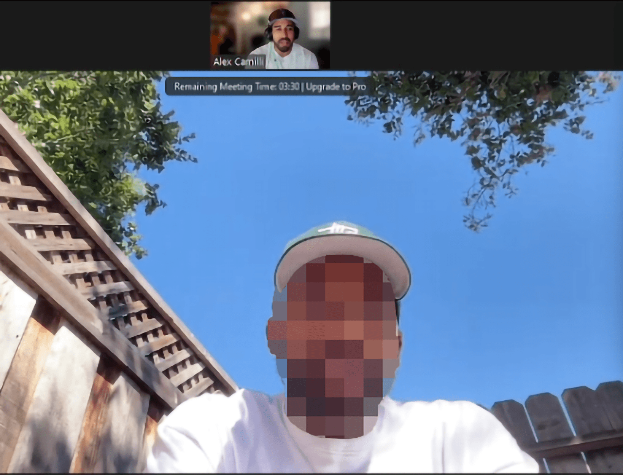
Our Questions focused on the topics of:
1.) The User’s Background Information
(E.g age, where they grew up, area of expertise, initial motivations, and student status)
2.) Behavior
(E.g areas they felt disadvantaged, how they cope with frustrations, formal education vs. self-regulated studies, and most fulfilling moments)
3.) Knowledge of Surroundings
(E.g interest in finding likeminded professionals, their awareness of local events, if they have an existing network, and what strategies have or have not proven useful)
Interview Findings
💡“I haven’t attended any networking events because I don’t have the skill set needed yet.”
💡“I didn’t know about design careers. I thought tech was only coding.”
💡“I don’t always feel safe in mostly white spaces.”
User Survey Findings
Before ideating potential features we sent a survey, in which we received 36 responses that was especially useful in quantifying our data. We did not exclusively target current students because of the intersectional issues that BIPOC tech and design practitioners faced when landing roles in their respective field.
Nearly 60% participants that responded to our survey are currently students.
The survey revealed that 27 participants would find great utility in a tool that let’s them get involved in professional events.
18 participants stated that mentorship would be the most important to them on their career path.
Affinity Map
Once we completed our semi-structured user interviews, we collectively decided that organizing the insights in an affinity map will prove useful in consolidating them into themes. We then concluded, that it was prevalent that the majority of our participants struggled establishing a community. After further discussion, we deduced that the qualitative data shows that:
There is an perceptible lack of diversity in products.
College curriculum does not teach students how to thrive in exclusionary work environments.
That roughly 60% of actions that introduced desirable results, involved building a network.

Competitive Analysis
Although these existing apps cater to a variety of different markets, it is worth analyzing competitors who have successfully created a platform focused solely on facilitating community events.

Meetup


Eventbrite


WeWork

Persona
After synthesizing all of the collected insights from our user interviews, I created a persona so that we can strategically empathize with our target audience so that the solutions we quickly ideate deliver the best possible experience.

Initial Sketches
Once we finalized our persona and referenced our problem statement, I began to sketch low-fidelity wireframes based on the research we conducted. These sketches were done early in the ideation phase before we pivoted towards creating an app that focused on community organization and professional development through meetups.

Mid-Fidelity Wireframes
During this phase, my team decided to commit to using Google’s Material 3 Design Kit in order ensure that I can rapidly ideate and design potential solutions. It would be in this phase we would make the commitment of making decisions strongly considering accessibility. This meant not only refocusing the features of the product, but beginning to omit ideas that become too complex to effectively satisfy our problem statement.

Usability Testing
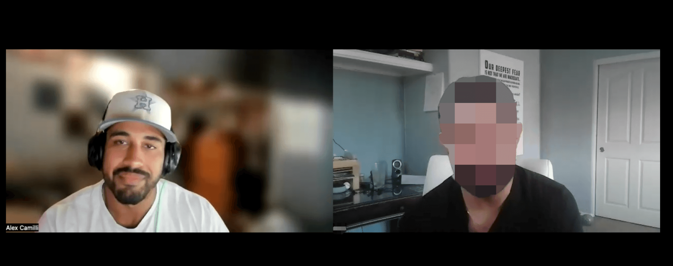
My team and I conducted a total of total of 8 usability studies and made the necessary changes to omit screens that were described as redundant or created more effort for the user to complete various tasks. We conducted 4 usability tests during when our prototype was in it’s mid-fidelity phase, and 4 tests once we pivoted towards focusing on creating a platform that facilitated skill-sharpening through community events.
The Reasoning of our Pivot
After receiving stakeholder feedback, the primary concern of BTFY was regarding the product relying too much on a LLM generative AI model to accomplish a large workload. Expecting it to index the user’s interests, preferred career path, and ideal events for them to attend can create undesired hallucinations and would ultimately be not as reliable. Instead, we took measures to ensure accessibility standards and personalization by:
Limiting the amount of clickable elements on the viewport.
Using large cards and meaningful headings.
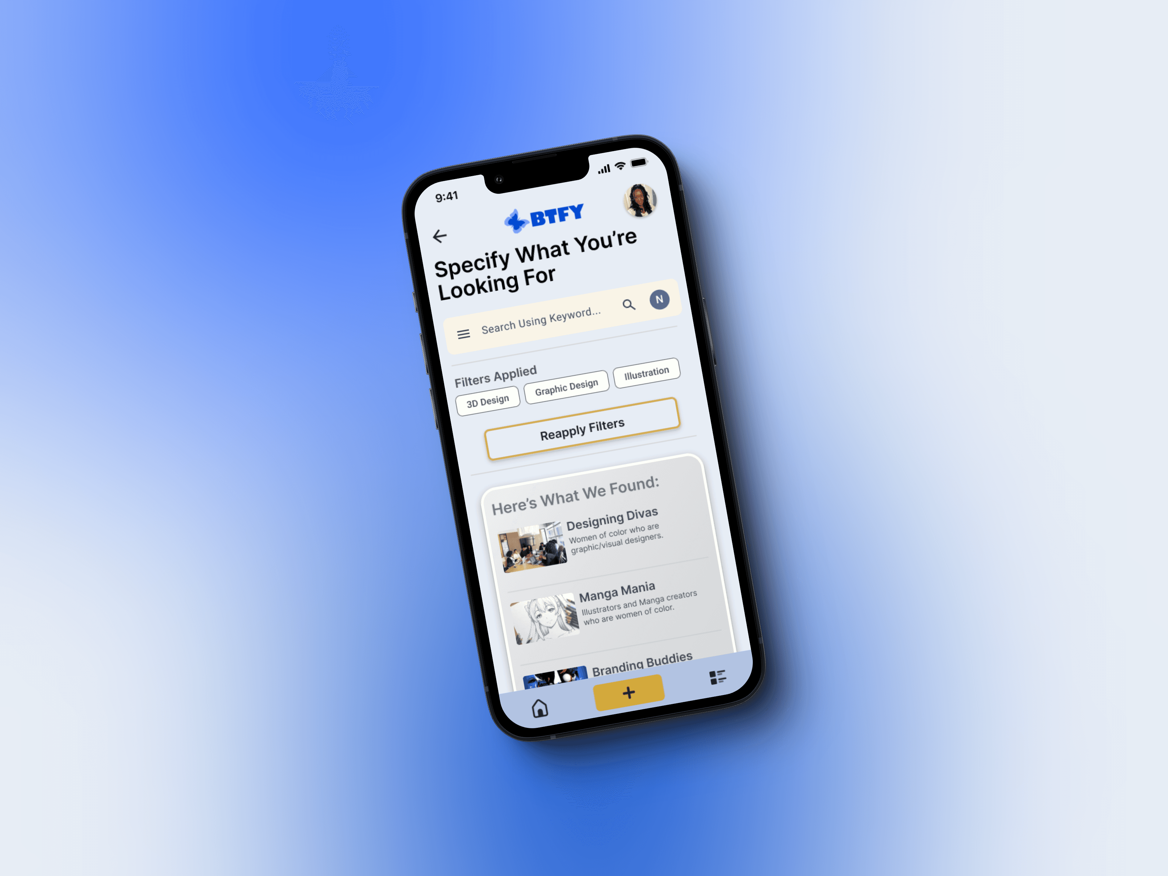
Enabling a search and filter function so the user can specify their career interests.
Streamlining features so that tasks can be completed seamlessly.
The Design System of BTFY
Typography
Gibson

Proxima Nova

Color
☀️ Yellow was chosen as our primary color because it often symbolizes a warming presence and the radiating sensation of the sun.
🩵 We decided on using light blue to establish a fresh and modern feel to our UI prevalent among many existing apps.
🧿 Blue is used as our secondary color because it represents tranquility, wisdom, and integrity building trust among your contemporaries.

Components
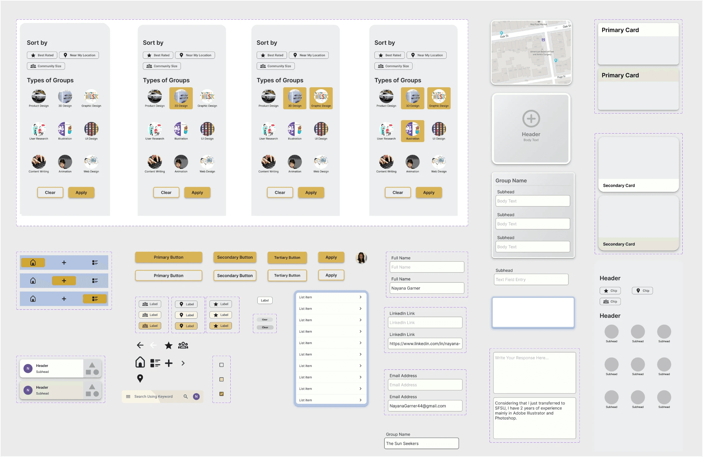
The icons, search text field, and tertiary card (seen in the bottom left of the image) in the hi-fidelity prototype originated from the Material 3 Design System available in Figma. However, I created a plethora of interactive components to make the UI feel responsive and remain consistent throughout.
Prototype
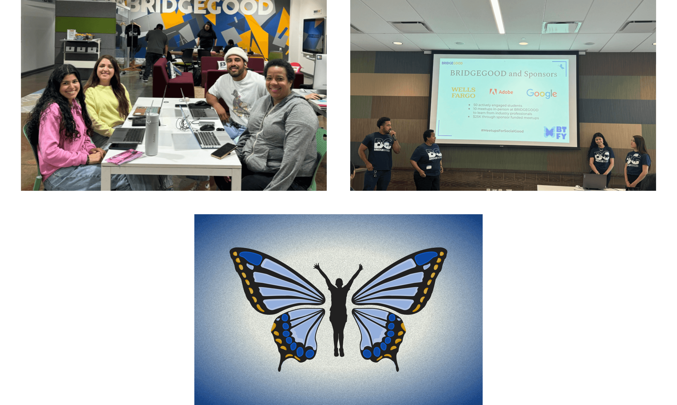
After completing the hi-fidelity prototype, I received a lot of high-level feedback from product designers within my network related to the UI. I made minor adjustments such as adjusting the corner radius for certain cards, revising the written content, and finalizing the prototype flow. My team then pitched our product, BTFY, to our stakeholders and over 30 working design professionals at the Wells Fargo Connections Space.
How might we create environments that support BIPOC students’ journey gaining the necessary skills to succeed and thrive in design/tech related roles?
Constructing our Problem Statement
There has always been a perpetually limited pool of BIPOC degree earners employed in the tech industry, and this lack of representation often leaves students unsure if the career path is actually feasible for them. College transfer students experience increased uncertainty in establishing a career pathway considering they are often without a community or mentor to learn how to navigate their desired career.
Proposing an Effective Solution
Introducing a digital tool that facilitates gatherings with an emphasis on professional development would prove beneficial for under-resourced students. Prioritizing safety above all else, BIPOC students can create safe spaces to pass on accumulated skills or learn from seasoned design professionals. Butterfly (BTFY) acknowledges the anxieties of committing to a group, and offers public meetups free of continuous involvement. Additional features include:
A career directory to learn to explore career options.
Thorough onboarding form for applicants to ensure safety and productivity.
Map featuring nearby groups based on current location.
“Sort” and “Filter” feature that uses chips to specify career interests.

Interviews
Primary Research: User Interviews
My team and I conducted 17 user interviews and to learn more about our target users’ pain points, motivations, and obstacles when pursuing a career in the design or tech industries. We collectively interviewed current students, recent grads, and career switchers so that we can effectively find common themes among the 3 groups when we synthesize their insights through affinity mapping.

Our Questions focused on the topics of:
1.) The User’s Background Information
(E.g age, where they grew up, area of expertise, initial motivations, and student status)
2.) Behavior
(E.g areas they felt disadvantaged, how they cope with frustrations, formal education vs. self-regulated studies, and most fulfilling moments)
3.) Knowledge of Surroundings
(E.g interest in finding likeminded professionals, their awareness of local events, if they have an existing network, and what strategies have or have not proven useful)
Interview Findings
💡“I haven’t attended any networking events because I don’t have the skill set needed yet.”
💡“I didn’t know about design careers. I thought tech was only coding.”
💡“I don’t always feel safe in mostly white spaces.”
User Survey Findings
Before ideating potential features we sent a survey, in which we received 36 responses that was especially useful in quantifying our data. We did not exclusively target current students because of the intersectional issues that BIPOC tech and design practitioners faced when landing roles in their respective field.
Nearly 60% participants that responded to our survey are currently students.
The survey revealed that 27 participants would find great utility in a tool that let’s them get involved in professional events.
18 participants stated that mentorship would be the most important to them on their career path.
Affinity Map
Once we completed our semi-structured user interviews, we collectively decided that organizing the insights in an affinity map will prove useful in consolidating them into themes. We then concluded, that it was prevalent that the majority of our participants struggled establishing a community. After further discussion, we deduced that the qualitative data shows that:
There is an perceptible lack of diversity in products.
College curriculum does not teach students how to thrive in exclusionary work environments.
That roughly 60% of actions that introduced desirable results, involved building a network.

Competitive Analysis
Although these existing apps cater to a variety of different markets, it is worth analyzing competitors who have successfully created a platform focused solely on facilitating community events.

Meetup


Eventbrite


WeWork

Persona
After synthesizing all of the collected insights from our user interviews, I created a persona so that we can strategically empathize with our target audience so that the solutions we quickly ideate deliver the best possible experience.

Initial Sketches
Once we finalized our persona and referenced our problem statement, I began to sketch low-fidelity wireframes based on the research we conducted. These sketches were done early in the ideation phase before we pivoted towards creating an app that focused on community organization and professional development through meetups.

Mid-Fidelity Wireframes
During this phase, my team decided to commit to using Google’s Material 3 Design Kit in order ensure that I can rapidly ideate and design potential solutions. It would be in this phase we would make the commitment of making decisions strongly considering accessibility. This meant not only refocusing the features of the product, but beginning to omit ideas that become too complex to effectively satisfy our problem statement.

Usability Testing
My team and I conducted a total of total of 8 usability studies and made the necessary changes to omit screens that were described as redundant or created more effort for the user to complete various tasks. We conducted 4 usability tests during when our prototype was in it’s mid-fidelity phase, and 4 tests once we pivoted towards focusing on creating a platform that facilitated skill-sharpening through community events.

The Reasoning of our Pivot
After receiving stakeholder feedback, the primary concern of BTFY was regarding the product relying too much on a LLM generative AI model to accomplish a large workload. Expecting it to index the user’s interests, preferred career path, and ideal events for them to attend can create undesired hallucinations and would ultimately be not as reliable. Instead, we took measures to ensure accessibility standards and personalization by:
Limiting the amount of clickable elements on the viewport.
Using large cards and meaningful headings.
Enabling a search and filter function so the user can specify their career interests.
Streamlining features so that tasks can be completed seamlessly.
The Design System of BTFY
Typography
Gibson

Proxima Nova

Color
☀️ Yellow was chosen as our primary color because it often symbolizes a warming presence and the radiating sensation of the sun.
🩵 We decided on using light blue to establish a fresh and modern feel to our UI prevalent among many existing apps.
🧿 Blue is used as our secondary color because it represents tranquility, wisdom, and integrity building trust among your contemporaries.

Components
The icons, search text field, and tertiary card (seen in the bottom left of the image) in the hi-fidelity prototype originated from the Material 3 Design System available in Figma. However, I created a plethora of interactive components to make the UI feel responsive and remain consistent throughout.

Prototype
After completing the hi-fidelity prototype, I received a lot of high-level feedback from product designers within my network related to the UI. I made minor adjustments such as adjusting the corner radius for certain cards, revising the written content, and finalizing the prototype flow. My team then pitched our product, BTFY, to our stakeholders and over 30 working design professionals at the Wells Fargo Connections Space.
How might we create environments that support BIPOC students’ journey gaining the necessary skills to succeed and thrive in design/tech related roles?
Constructing our Problem Statement
There has always been a perpetually limited pool of BIPOC degree earners employed in the tech industry, and this lack of representation often leaves students unsure if the career path is actually feasible for them. College transfer students experience increased uncertainty in establishing a career pathway considering they are often without a community or mentor to learn how to navigate their desired career.
Proposing an Effective Solution
Introducing a digital tool that facilitates gatherings with an emphasis on professional development would prove beneficial for under-resourced students. Prioritizing safety above all else, BIPOC students can create safe spaces to pass on accumulated skills or learn from seasoned design professionals. Butterfly (BTFY) acknowledges the anxieties of committing to a group, and offers public meetups free of continuous involvement. Additional features include:
A career directory to learn to explore career options.
Thorough onboarding form for applicants to ensure safety and productivity.
Map featuring nearby groups based on current location.
“Sort” and “Filter” feature that uses chips to specify career interests.

Interviews
Primary Research: User Interviews
My team and I conducted 17 user interviews and to learn more about our target users’ pain points, motivations, and obstacles when pursuing a career in the design or tech industries. We collectively interviewed current students, recent grads, and career switchers so that we can effectively find common themes among the 3 groups when we synthesize their insights through affinity mapping.

Our Questions focused on the topics of:
1.) The User’s Background Information
(E.g age, where they grew up, area of expertise, initial motivations, and student status)
2.) Behavior
(E.g areas they felt disadvantaged, how they cope with frustrations, formal education vs. self-regulated studies, and most fulfilling moments)
3.) Knowledge of Surroundings
(E.g interest in finding likeminded professionals, their awareness of local events, if they have an existing network, and what strategies have or have not proven useful)
Interview Findings
💡“I haven’t attended any networking events because I don’t have the skill set needed yet.”
💡“I didn’t know about design careers. I thought tech was only coding.”
💡“I don’t always feel safe in mostly white spaces.”
User Survey Findings
Before ideating potential features we sent a survey, in which we received 36 responses that was especially useful in quantifying our data. We did not exclusively target current students because of the intersectional issues that BIPOC tech and design practitioners faced when landing roles in their respective field.
Nearly 60% participants that responded to our survey are currently students.
The survey revealed that 27 participants would find great utility in a tool that let’s them get involved in professional events.
18 participants stated that mentorship would be the most important to them on their career path.
Affinity Map
Once we completed our semi-structured user interviews, we collectively decided that organizing the insights in an affinity map will prove useful in consolidating them into themes. We then concluded, that it was prevalent that the majority of our participants struggled establishing a community. After further discussion, we deduced that the qualitative data shows that:
There is an perceptible lack of diversity in products.
College curriculum does not teach students how to thrive in exclusionary work environments.
That roughly 60% of actions that introduced desirable results, involved building a network.

Competitive Analysis
Although these existing apps cater to a variety of different markets, it is worth analyzing competitors who have successfully created a platform focused solely on facilitating community events.

Meetup


Eventbrite


WeWork

Persona
After synthesizing all of the collected insights from our user interviews, I created a persona so that we can strategically empathize with our target audience so that the solutions we quickly ideate deliver the best possible experience.

Initial Sketches
Once we finalized our persona and referenced our problem statement, I began to sketch low-fidelity wireframes based on the research we conducted. These sketches were done early in the ideation phase before we pivoted towards creating an app that focused on community organization and professional development through meetups.

Mid-Fidelity Wireframes
During this phase, my team decided to commit to using Google’s Material 3 Design Kit in order ensure that I can rapidly ideate and design potential solutions. It would be in this phase we would make the commitment of making decisions strongly considering accessibility. This meant not only refocusing the features of the product, but beginning to omit ideas that become too complex to effectively satisfy our problem statement.

Usability Testing
My team and I conducted a total of total of 8 usability studies and made the necessary changes to omit screens that were described as redundant or created more effort for the user to complete various tasks. We conducted 4 usability tests during when our prototype was in it’s mid-fidelity phase, and 4 tests once we pivoted towards focusing on creating a platform that facilitated skill-sharpening through community events.

The Reasoning of our Pivot
After receiving stakeholder feedback, the primary concern of BTFY was regarding the product relying too much on a LLM generative AI model to accomplish a large workload. Expecting it to index the user’s interests, preferred career path, and ideal events for them to attend can create undesired hallucinations and would ultimately be not as reliable. Instead, we took measures to ensure accessibility standards and personalization by:
Limiting the amount of clickable elements on the viewport.
Using large cards and meaningful headings.
Enabling a search and filter function so the user can specify their career interests.
Streamlining features so that tasks can be completed seamlessly.
The Design System of BTFY
Typography
Gibson

Proxima Nova

Color
☀️ Yellow was chosen as our primary color because it often symbolizes a warming presence and the radiating sensation of the sun.
🩵 We decided on using light blue to establish a fresh and modern feel to our UI prevalent among many existing apps.
🧿 Blue is used as our secondary color because it represents tranquility, wisdom, and integrity building trust among your contemporaries.

Components
The icons, search text field, and tertiary card (seen in the bottom left of the image) in the hi-fidelity prototype originated from the Material 3 Design System available in Figma. However, I created a plethora of interactive components to make the UI feel responsive and remain consistent throughout.

Prototype
After completing the hi-fidelity prototype, I received a lot of high-level feedback from product designers within my network related to the UI. I made minor adjustments such as adjusting the corner radius for certain cards, revising the written content, and finalizing the prototype flow. My team then pitched our product, BTFY, to our stakeholders and over 30 working design professionals at the Wells Fargo Connections Space.
How might we create environments that support BIPOC students’ journey gaining the necessary skills to succeed and thrive in design/tech related roles?
Constructing our Problem Statement
There has always been a perpetually limited pool of BIPOC degree earners employed in the tech industry, and this lack of representation often leaves students unsure if the career path is actually feasible for them. College transfer students experience increased uncertainty in establishing a career pathway considering they are often without a community or mentor to learn how to navigate their desired career.
Proposing an Effective Solution
Introducing a digital tool that facilitates gatherings with an emphasis on professional development would prove beneficial for under-resourced students. Prioritizing safety above all else, BIPOC students can create safe spaces to pass on accumulated skills or learn from seasoned design professionals. Butterfly (BTFY) acknowledges the anxieties of committing to a group, and offers public meetups free of continuous involvement. Additional features include:
A career directory to learn to explore career options.
Thorough onboarding form for applicants to ensure safety and productivity.
Map featuring nearby groups based on current location.
“Sort” and “Filter” feature that uses chips to specify career interests.

Interviews
Primary Research: User Interviews
My team and I conducted 17 user interviews and to learn more about our target users’ pain points, motivations, and obstacles when pursuing a career in the design or tech industries. We collectively interviewed current students, recent grads, and career switchers so that we can effectively find common themes among the 3 groups when we synthesize their insights through affinity mapping.

Our Questions focused on the topics of:
1.) The User’s Background Information
(E.g age, where they grew up, area of expertise, initial motivations, and student status)
2.) Behavior
(E.g areas they felt disadvantaged, how they cope with frustrations, formal education vs. self-regulated studies, and most fulfilling moments)
3.) Knowledge of Surroundings
(E.g interest in finding likeminded professionals, their awareness of local events, if they have an existing network, and what strategies have or have not proven useful)
Interview Findings
💡“I haven’t attended any networking events because I don’t have the skill set needed yet.”
💡“I didn’t know about design careers. I thought tech was only coding.”
💡“I don’t always feel safe in mostly white spaces.”
User Survey Findings
Before ideating potential features we sent a survey, in which we received 36 responses that was especially useful in quantifying our data. We did not exclusively target current students because of the intersectional issues that BIPOC tech and design practitioners faced when landing roles in their respective field.
Nearly 60% participants that responded to our survey are currently students.
The survey revealed that 27 participants would find great utility in a tool that let’s them get involved in professional events.
18 participants stated that mentorship would be the most important to them on their career path.
Affinity Map
Once we completed our semi-structured user interviews, we collectively decided that organizing the insights in an affinity map will prove useful in consolidating them into themes. We then concluded, that it was prevalent that the majority of our participants struggled establishing a community. After further discussion, we deduced that the qualitative data shows that:
There is an perceptible lack of diversity in products.
College curriculum does not teach students how to thrive in exclusionary work environments.
That roughly 60% of actions that introduced desirable results, involved building a network.

Competitive Analysis
Although these existing apps cater to a variety of different markets, it is worth analyzing competitors who have successfully created a platform focused solely on facilitating community events.

Meetup


Eventbrite


WeWork

Persona
After synthesizing all of the collected insights from our user interviews, I created a persona so that we can strategically empathize with our target audience so that the solutions we quickly ideate deliver the best possible experience.

Initial Sketches
Once we finalized our persona and referenced our problem statement, I began to sketch low-fidelity wireframes based on the research we conducted. These sketches were done early in the ideation phase before we pivoted towards creating an app that focused on community organization and professional development through meetups.

Mid-Fidelity Wireframes
During this phase, my team decided to commit to using Google’s Material 3 Design Kit in order ensure that I can rapidly ideate and design potential solutions. It would be in this phase we would make the commitment of making decisions strongly considering accessibility. This meant not only refocusing the features of the product, but beginning to omit ideas that become too complex to effectively satisfy our problem statement.

Usability Testing
My team and I conducted a total of total of 8 usability studies and made the necessary changes to omit screens that were described as redundant or created more effort for the user to complete various tasks. We conducted 4 usability tests during when our prototype was in it’s mid-fidelity phase, and 4 tests once we pivoted towards focusing on creating a platform that facilitated skill-sharpening through community events.

The Reasoning of our Pivot
After receiving stakeholder feedback, the primary concern of BTFY was regarding the product relying too much on a LLM generative AI model to accomplish a large workload. Expecting it to index the user’s interests, preferred career path, and ideal events for them to attend can create undesired hallucinations and would ultimately be not as reliable. Instead, we took measures to ensure accessibility standards and personalization by:
Limiting the amount of clickable elements on the viewport.
Using large cards and meaningful headings.
Enabling a search and filter function so the user can specify their career interests.
Streamlining features so that tasks can be completed seamlessly.
The Design System of BTFY
Typography
Gibson

Proxima Nova

Color
☀️ Yellow was chosen as our primary color because it often symbolizes a warming presence and the radiating sensation of the sun.
🩵 We decided on using light blue to establish a fresh and modern feel to our UI prevalent among many existing apps.
🧿 Blue is used as our secondary color because it represents tranquility, wisdom, and integrity building trust among your contemporaries.

Components
The icons, search text field, and tertiary card (seen in the bottom left of the image) in the hi-fidelity prototype originated from the Material 3 Design System available in Figma. However, I created a plethora of interactive components to make the UI feel responsive and remain consistent throughout.

Prototype
After completing the hi-fidelity prototype, I received a lot of high-level feedback from product designers within my network related to the UI. I made minor adjustments such as adjusting the corner radius for certain cards, revising the written content, and finalizing the prototype flow. My team then pitched our product, BTFY, to our stakeholders and over 30 working design professionals at the Wells Fargo Connections Space.


Reflection
What I learned throughout this project
Throughout designing this project, I found the immense value of investing time into creating and maintaining a design system. I was responsible for designing the hi-fidelity prototype while conducting multiple rounds of interviews and usability studies. In such a fast-paced working environment I’ve discovered that documentation is crucial to rapidly ideate with an inherent focus on solving your users’ problems as effectively as possible. Other skills I’ve built throughout this process include:
Ideating based on numerous insights gathered from our usability studies.
Garnering stakeholder interest by covering the business value that BTFY brings to non-profit agencies and college institutions.
Collaborating and articulating our design design decisions based on the results of our qualitative analysis.
What's Next?
As a team, we decided it would be most beneficial to transfer students and international students if BTFY supported different languages.
We plan to consider including online meetups and events so that students can be involved in community events from anywhere in the world.
Adding a direct messaging feature, would improve the quality of the professional relationships that community members build as they grow their own network.


Notes
The app designs on this webpage were created in Figma by Alexander Camilli.
I actively contributed alongside an amazing team of designers, including Karissa Garcia, Jae Hamilton, Michel Reynoso.
Notes
The app designs on this webpage were created in Figma by Alexander Camilli.
I actively contributed alongside an amazing team of designers, including Karissa Garcia, Jae Hamilton, Michel Reynoso.
Notes
The app designs on this webpage were created in Figma by Alexander Camilli.
I actively contributed alongside an amazing team of designers, including Karissa Garcia, Jae Hamilton, Michel Reynoso.